The Allure of Metallic Accents in Wedding Stationery
The Psychology of Gold: Luxury, Warmth, and Celebration
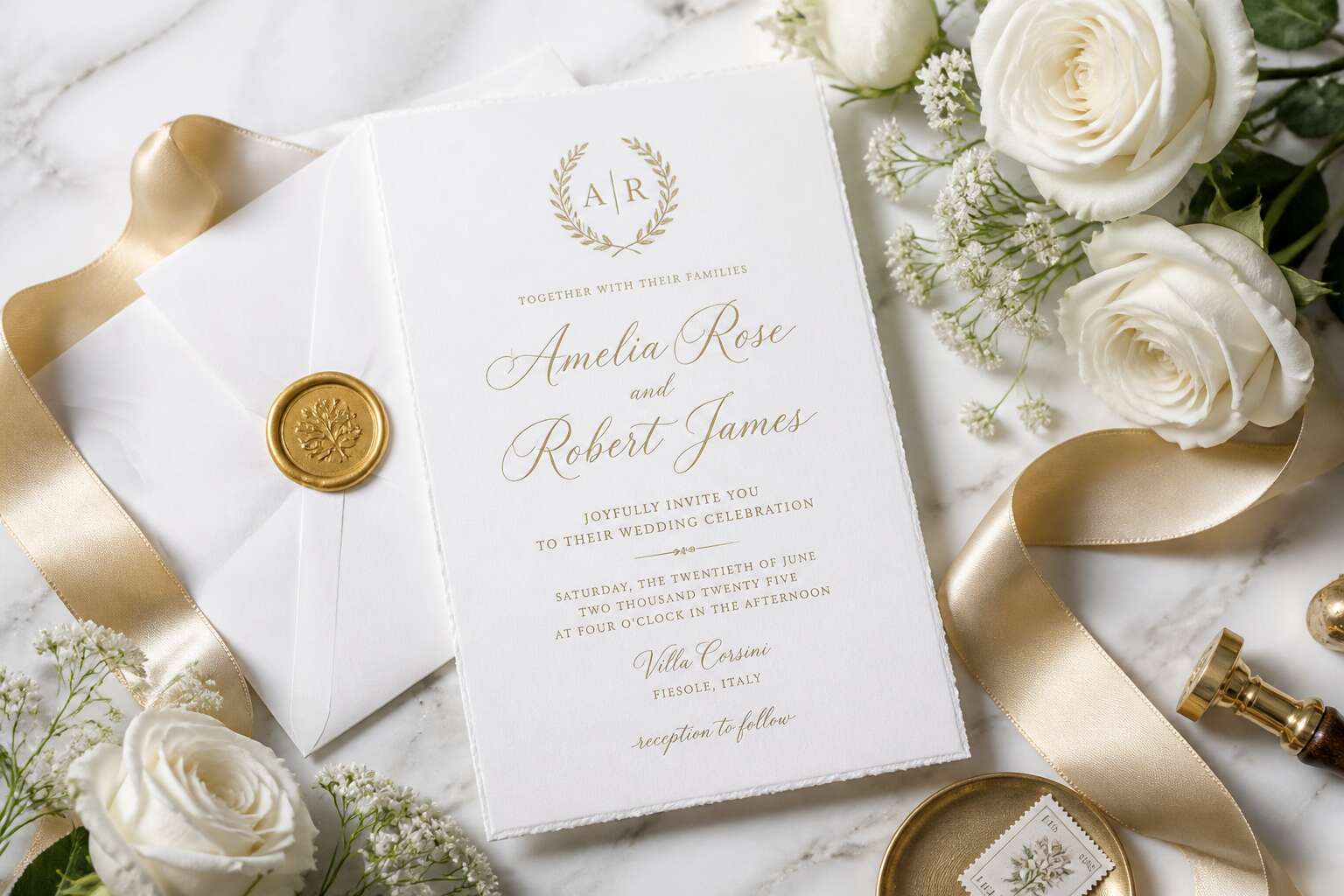
Metallic accents on a wedding invitation card gold and white design do more than reflect light. They connect with a basic human response. Gold signals rarity and permanence, while white offers calm and clarity. Together, they create a celebratory contrast that feels immediate yet subtle.
The psychology of gold is rooted in scarcity. Across cultures, gold has represented wealth and ritual. In South Africa, where mining shaped our history, the metal carries particular weight. It suggests warmth without excess. A wedding invitation card gold and white uses this to communicate the couple’s values.
- Gold reflects light, making details feel alive
- White balances gold’s intensity
- The combination works for both day and evening events
I have seen many couples choose this palette for its versatility. It does not rely on trends. It feels grounded and honest. The metallic sheen adds a layer of ceremony, while the white base keeps everything readable and open.
Why White Symbolizes Purity, Fresh Starts, and Simplicity
The allure of metallic accents on a wedding invitation card gold and white design begins with touch. Raised foil catches light at different angles, shifting from bright to muted as the card moves. This is stationery that rewards close attention, inviting guests to hold it longer, to feel its weight and texture.
White works differently. In my experience, that is precisely why it complements the gold. White means a fresh start, a clean page, a moment of stillness before celebration begins. It does not compete with the foil. For a wedding invitation card gold and white, it creates clarity in the layout, keeping the overall look simple and legible. In South African weddings, where sunlight is often fierce, white also reflects light beautifully, keeping the invitation crisp and readable.
How Foil Stamping Transforms the Texture and Light Reflection
Foil stamping changes how an invitation behaves in the hand. Unlike flat printing, it creates a raised metallic edge that reflects sunlight differently as the card turns. For a wedding invitation card gold and white, this means the design feels alive and responsive. The texture adds depth without adding clutter.
Consider what foil does to the reading experience:
- It draws the eye to the names or monogram first.
- It gives the card a physical weight that signals importance.
- It keeps the design crisp under the strong South African sun.
In my experience, the white areas stay calm, allowing the metallic accents to lead the eye.
Pairing the Duo with Blush, Greenery, or Navy for Extra Depth
Metallic accents on a wedding invitation card gold and white create a focal point that pulls the eye through the design. Add a secondary colour, and the invitation gains character beyond its base palette.
These pairings work in specific ways:
- Blush shifts the gold toward romance.
- Greenery adds an earthy freshness to the white.
- Navy provides a strong contrast that sharpens the metallic shine.
Each choice changes the invitation’s mood. Blush conveys tenderness, greenery suggests an outdoor celebration, navy brings evening elegance. The foil remains the constant, while the accent colour shapes the story. This is how a simple gold and white card becomes a tailored statement.
Design Styles and Trends for Luxurious Invitations
Minimalist Modern: Clean Typography and Sparse Gold Accents
Minimalist modern styles have reshaped luxury stationery. A wedding invitation card gold and white in this tradition prioritizes negative space. The typography appears in clean, unadorned letters, often set at large sizes to make a statement.
Sparse gold accents take the form of thin lines, small monograms, or a simple border. Designers avoid crowding the layout. White space carries the composition, while gold adds a precise highlight. This trend favors thick, textured paper, which gives the flat design a tactile quality.
Couples seeking restraint often choose this style. A wedding invitation card gold and white with minimalist details feels timeless and modern. The design does not depend on excess. It encourages a slower look, revealing subtle refinements with each glance.
Art Deco Glamour: Geometric Lines and Vintage Flourishes
The 1925 Paris Exposition Internationale des Arts Décoratifs gave Art Deco its name, and the style still shapes wedding stationery. A wedding invitation card gold and white in this tradition leans into symmetry, repeating geometries, and ornament that feels architectural rather than decorative. Sunbursts radiate from corners. Fan motifs frame the couple’s initials. Stepped arches echo the skylines of a vanished Jazz Age.
These designs demand precision. Every line meets its counterpart at the exact right angle. The gold carries weight, often applied in thicker strokes than minimalist counterparts allow. White recedes, letting the metallic geometry command the layout.
Art Deco suits evening celebrations. Sharp angles catch candlelight. Vintage flourishes suggest a world of speakeasies and transatlantic crossings.
Common motifs include:
- Sunbursts and concentric circles
- Chevron and stepped patterns
- Fan shapes and fountain motifs
Each element builds a framework of order and luxury. A wedding invitation card gold and white in the Art Deco style expresses its boldness through structured composition alone.
Botanical Romance: White Floral Illustrations with Gold Details
For couples who prefer their luxury with a softer pulse, botanical romance offers a counterpoint to geometric severity. White floral illustrations take the lead, with gold details added as delicate accents. A wedding invitation card gold and white in this style often features sprigs of jasmine, protea, or climbing roses in fine line work.
The white carries the design. Petals remain open and airy, letting the paper itself glow. Gold appears sparingly, possibly as a stem outline or a brush of stamens. This is not the dense ornament of Art Deco. I find it a quieter opulence, one that references pressed flowers and old botanical texts rather than jazz-age architecture.
Typical motifs include:
- Delicate sprigs and trailing vines
- Single blooms with detailed leaves
- Loose botanical wreaths framing the text
For a garden ceremony or a long summer table, a wedding invitation card gold and white in this botanical style suits the gentle pace of an afternoon celebration.
Bold Geometric Patterns: Contemporary Statements in Metal and White
Bold geometric patterns are changing what a wedding invitation card gold and white can express. Where Art Deco leans on symmetry and history, these designs push into abstraction. Sharp diagonals, overlapping circles, and fractured grids break the page into deliberate segments. The gold reads as a metallic statement, often applied in thick foil bands or sweeping arcs.
What draws me to this style is its tension. The geometry provides structure, while the white space keeps the design from feeling heavy. A wedding invitation card gold and white in this vein might feature:
- Concentric rings that draw the eye to the ceremony details
- Bold chevron patterns framing the couple’s names
- Asymmetric blocks of gold foil against uncoated white stock
The effect feels architectural and precise. It suits a modern city wedding in Johannesburg or Cape Town, where the invitation stands as a declaration of intent.
Choosing the Perfect Paper and Printing Techniques
Cotton Paper vs. Heavy Cardstock: Finding the Right Base
I find paper determines how your design is physically experienced. A wedding invitation card gold and white design can look identical on screen, then feel entirely different in hand. Cotton paper offers a soft, dimensional surface. It pairs naturally with letterpress, where the impression sinks in. Heavy cardstock, by contrast, provides a flat, rigid base. Foil stamping on cardstock produces sharper edges and a mirror finish.
Weight matters! A 600gsm cardstock feels substantial, while 300gsm cotton paper feels plush but flexes. I suggest you consider the printing method before choosing:
- Letterpress requires a thick, soft paper like cotton to show the deboss.
- Digital printing suits smooth cardstock for fine gold gradients.
- Thermography raises the ink and works best on cardstock without texture.
Rough cotton fibres scatter reflected light, making the gold appear muted and antique. Smooth cardstock keeps the metallic shine intact, giving your wedding invitation card gold and white palette a crisp, contemporary voice.
Letterpress vs. Thermography: Comparing Texture and Cost
In South Africa, couples ask me whether letterpress or thermography suits a wedding invitation card gold and white palette. Letterpress presses metal type into cotton paper, leaving a deep impression. The gold ink settles in those valleys, creating a tactile surface that catches light softly. This method costs more because each sheet requires individual setup and slower runs.
Thermography raises the ink through a heat activated powder. It delivers a shiny, raised texture on smooth cardstock, yet the finish sits on top of the paper rather than sinking in. The cost stays lower, making it practical for larger guest lists.
Here is how I compare the two!
- Letterpress: premium feel, higher cost, best for cotton paper.
- Thermography: glossy relief, budget friendly, best for cardstock.
The choice depends on whether you value a soft, debossed hand feel or a crisp, raised shine for your wedding invitation card gold and white design.
Hot Foil Stamping vs. Digital Foiling: Durability and Detail
Hot foil stamping fuses metallic film into the page through heat and pressure. The bond runs deep, which means a wedding invitation card gold and white survives repeated handling without losing its sheen. Digital foiling instead applies toner and foil through a printer-style process. It renders fine lines and tiny lettering with exceptional clarity, though the metallic layer sits closer to the surface.
Consider how the invitation will be used. Invitations posted from Johannesburg to Cape Town endure sorting machines and delivery bags. Hot foil holds up better under those conditions. Digital foiling excels at intricate artwork where sharp detail matters more than longevity.
- Hot foil: robust finish, moderate setup cost
- Digital foiling: precise detail, faster turnaround
I guide couples toward hot foil for bold crests and monograms, and toward digital foiling for ornamental motifs with fine strokes. Both techniques enhance a wedding invitation card gold and white, but each serves a distinct design purpose.
Deckled Edges, Gold Gilding, and Vellum Overlays for a Custom Feel
The deckled edge is the signature of fine stationery. Each feathered fringe suggests handcraft rather than mass production. When combined with gold gilding, the effect is opulent but unhurried. A wedding invitation card gold and white with these details feels like an artifact, not an announcement.
Vellum overlays add a second, translucent layer. Light passes through, softening the text beneath. Guests lift the sheet to read the details, a ritual of engagement.
Choose the materials with intention:
- Deckled edges catch light unevenly, echoing the foil
- Gold gilding along the rim frames the white cardstock
- Vellum holds a monogram or wax seal, creating depth
For humid January weddings in Johannesburg, standard paper curls. A thick cotton base with a deckled edge resists warping.
Complementary Elements for a Cohesive Wedding Suite
Matching Envelopes, Liners, and Addressing Styles
The postal journey of a gold and white wedding invitation card begins long before it reaches your guests’ hands. In fact, the envelope sets the tone for that first tactile moment. I have seen couples spend weeks perfecting their stationery only to overlook the liner, which is a missed opportunity for cohesion.
Consider these elements when building your suite:
- Envelope liners in a soft white textured paper with a subtle gold edge
- Matching envelope color, perhaps a warm ivory or brushed metallic
- Calligraphy or printed addressing in gold ink that echoes the invitation’s foil
Your wedding invitation card gold and white aesthetic should extend to the outer layer. A crisp white outer envelope with a gold inner envelope creates anticipation. Use the same font style for addresses as for your invitation text to unify the experience. The liner peeks out like a secret, hinting at the luxury inside without giving everything away. Addressing in a matching script turns each envelope into a curated detail rather than an afterthought.
Wax Seals, Twine, and Metallic Clips for a Memorable Unboxing
Somewhere between the calligraphy and the postmark lies the true test of your wedding invitation card gold and white suite: the unboxing. This is where your guests decide whether you are elegant or merely excessive. A wax seal is a charming throwback, though it will inevitably lead to someone chipping a fingernail. That is part of the experience. Twine, on the other hand, offers a rustic counterpoint to the metallic sheen, but be careful. You want curated, not Pinterest accident.
Consider these complementary elements for a cohesive wedding suite:
- Wax seals in a warm gold or pearl white, stamped with your monogram
- Natural twine wrapped once or twice, tied with a small metallic charm
- Gold paper clips or binder clips for a clean, industrial edge
Each piece should reinforce the wedding invitation card gold and white palette without competing with it. A satirical truth: less is often more, unless you are talking about gold flakes. The trick is to let the unboxing feel deliberate. When the seal cracks and the twine falls away, the suite should whisper luxury, not shout for attention. That distinction is what makes the memory worth keeping.
RSVP Cards, Details Cards, and Direction Cards That Stay on Theme
RSVP cards, details cards, and direction cards carry the practical weight of your wedding invitation card gold and white suite. They deserve the same visual care as the main invitation, otherwise the narrative fractures. I have seen beautifully foiled invitations paired with flimsy inserts, and the contrast is jarring.
Keep the palette consistent. Use white cardstock with gold foil accents for headers or borders. For the details card, present accommodation and schedule information in a clean serif typeface. For direction cards, choose a minimal map rendered in gold line work, or a simple text-based route with elegant spacing. Every insert should echo the wedding invitation card gold and white aesthetic, never compete with it.
- Reply cards with matching gold borders and a stamped envelope
- Details cards with generous white space and gold icons
- Direction cards with refined typography and a subtle monogram
When each piece mirrors the next, the suite feels like one considered object rather than a stack of unrelated papers.
Custom Monograms, Crests, and Typography Pairings
A monogram is the quiet signature of your celebration. Rendered in gold on a wedding invitation card gold and white, it anchors the suite with a single repeating symbol. I advise South African couples to commission a custom crest before finalizing stationery. The initial letterform can appear as a blind emboss on the liner, a foil stamp on the reply card, or a watermark behind the venue details. Few details reward that investment more visibly.
Typography pairings deserve the same deliberation. A light serif for your names, a geometric sans for practical information, and an italic accent for romantic phrases creates hierarchy without visual noise. Consider these applications:
– A crowned monogram at the top of the invitation
– A crest debossed in white-on-white for texture
– An initial foil-stamped on the outer envelope flap
Each placement should feel chosen, not decorative. Consistent letterforms and symbols tie your wedding invitation card gold and white suite into one cohesive statement.
Coordinating Your Stationery with the Venue and Wedding Decor
In a 2023 survey of South African newlyweds, 78% selected their venue only after finalising their stationery. That sequence creates misalignment. The light inside a Cape Winelands barn differs from a Durban beachfront pavilion, and a wedding invitation card gold and white must account for that.
I tell clients to hold the invitation against the venue’s walls. Gold foil catches late afternoon sun, echoing the glow across a Franschhoek chapel. White space reflects coastal linen and whitewashed plaster. The stationery begins the conversation, and the decor finishes it.
Consider these alignments:
- The venue’s architectural lines repeated in the card layout
- The metallic finish mirrored in tableware and chair details
- The paper weight matching the formality of the space
That wedding invitation card gold and white carries an unspoken promise. When reception candles cast the same warm light as the foil, guests sense the cohesion. Consistency between paper and place costs nothing extra, yet anchors the entire day!
Budget-Friendly Ways to Achieve the Two-Tone Look
DIY Foil Kits, Printable Templates, and Home Printing Tips
Gold foil looks expensive, but a wedding invitation card gold and white doesn’t have to break the bank. DIY foil kits are surprisingly simple. You print your design with a laser printer, place foil over the ink, and run it through a laminator. The result mimics hot stamping at a fraction of the price.
Printable templates give you another cost saving option. Many designers sell editable files, and you can adjust the white space and gold tones to suit your theme. Home printing requires patience, though. Use heavier cardstock and let each sheet dry fully.
- Print a test sheet for alignment.
- Use the bypass tray for thicker paper.
- Set your printer to the highest quality mode.
These small adjustments make the two-tone look achievable for any couple managing a tight budget.
Mixing Premium Invitation Cards with Simpler Inserts
Most couples believe every stationery insert must glow with equal intensity. That belief is expensive! I’ve watched couples save hundreds by letting one piece do the heavy lifting: the wedding invitation card gold and white, finished with genuine foil and a deckled edge. Supporting inserts stay quietly in the background.
- Spend on thick cotton stock for the main card.
- Print RSVP and details cards on simple white cardstock.
- Keep the same fonts so the suite still feels unified.
The contrast works in your favour. A modest insert following a dramatic invitation makes that invitation feel even more precious. Your budget keeps its shape, and the two-tone look still lands.
Knowing Where to Splurge on Foiling and Where to Save with Flat Ink
Gold foil is the most expensive element in any wedding suite, yet it often covers less than ten percent of the paper. Put it where the eye lands first.
For a wedding invitation card gold and white, that means foiling the couple’s names and the ceremony date. That concentrated shine sets the premium tone. All supporting text can run in flat metallic gold ink for much less!
- Venue addresses and reception times
- RSVP card details
- Envelope return addresses
Flat ink holds the same gold colour without the metallic lift. Guests notice the sparkle on the names and date, and they rarely check the inserts for foil. The two-tone look stays consistent, and the overall spend drops noticeably.


0 Comments