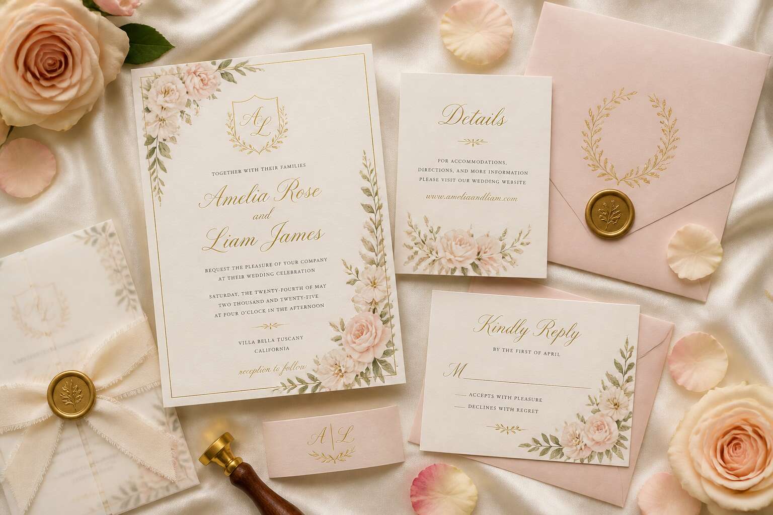
Selecting the Ideal Canvas for Your Invitation
Paper Types and Textures
Your guests will touch your invitation before they read a single word! Tactile response shapes their first impression of your wedding invitation background. Cotton rag papers give a soft, dimensional surface, while a smooth satin finish reduces glare and feels modern. The substrate’s weight and absorption rate matter. A heavy 600gsm board conveys permanence, whereas a translucent vellum creates airy mystery.
For destination or outdoor weddings, these choices gain importance.
- Linen or laid textures mask smudges and provide an organic feel.
- Synthetic blends offer water resistance and durability.
- Deckled edges bring a handcrafted, artisanal aesthetic.
The right paper turns a digital design into a physical artefact. It signals the tone of your ceremony before the envelope is unsealed.
Digital Backgrounds vs. Print
Your wedding invitation background may be designed on a screen, but it lives on paper. Digital displays in RGB, where colors glow with backlit intensity. Print uses CMYK, which caps brightness. The difference is startling! A soft blush on your laptop can shift to a dull tan on the card.
Resolution matters. Pixel dimensions determine clarity. Digital works at 72 DPI. Print needs 300 DPI. A pattern sourced online may fail at print scale.
- Screen uses additive color. Print uses subtractive ink.
- Digital allows endless revisions. Print demands a final proof.
- Backlit brilliance differs from reflected light.
I have seen couples love a digital mockup, then recoil at the printed proof. The gulf is real. When you choose your wedding invitation background, ask whether it will live on phones or in hands. That answer shapes every design decision.
Color Palettes and Moods
The canvas bends color before the ink dries. A soft blush reads as warm and romantic on a textured surface. The same blush turns flat and cold on a glossy one. That shift is not a printing error. It is the surface dictating how light interacts with pigment. When you choose a wedding invitation background, consider how the texture supports the mood.
- Deep forest greens require a fabric-like weave to feel lush.
- Pale pinks on glossy paper can lose their blush.
- Rich terracottas grow muted on overly textured board.
The canvas you choose carries the emotional weight of the event. A rough, fibrous backdrop adds organic depth to earthy palettes. A smooth, coated backdrop keeps bright or metallic colors crisp and controlled. Match the surface to the sentiment, not the trend.
Sustainable and Eco-Friendly Options
According to the Paper Manufacturers Association of South Africa, the local industry recycles over 70% of its fibre. The average couple, deep in a war over font sizes, rarely stops to consider the environmental footprint of their wedding invitation background. Yet the canvas itself sets the tone before anyone reads a single word.
When selecting the ideal canvas, examine options with shorter renewal cycles. Bamboo fibre holds ink beautifully and feels substantial. Sugarcane paper takes on dye with unusual warmth. Recycled cotton offers a soft, durable texture. Each surface changes how the design reads.
- Recycled cotton paper, soft and durable.
- Hemp blend, sturdy with a natural fleck.
- Grass paper, embedded with visible fibres.
These options keep the wedding invitation background elegant while sparing the Karoo’s fragile ecosystems. A considered canvas honours both your guest and the ground beneath your feet.
Design Trends That Elevate Wedding Stationery
Botanical Illustrations and Florals
There is something quietly magnetic about a hand-rendered stem of fynbos, its delicate petals captured in ink rather than pixels. Couples are increasingly turning to botanical illustrations to soften a wedding invitation background, replacing flat digital washes with intricate, layered linework. This trend speaks to a desire for permanence, for stationery that feels like a keepsake rather than a notice.
I have watched brides trace their fingers over printed olive branches and wild rosemary, noting how the texture of the paper influences every leaf. In South Africa, indigenous flora like proteas and ericas offer a distinctive language for celebration. A botanical arrangement can carry a sense of place without shouting it.
- Rustic eucalyptus sprigs for gentle framing
- Bold king proteas as a central focal point
These illustrations invite a slower gaze, turning preparation into a ritual. Ink lines breathe within the margins, and the eye rests on something organic and unhurried.
Minimalist and Modern Aesthetics
According to a 2024 survey by the South African Wedding Collective, 71% of couples now ask for simplicity in their stationery. Minimalist and modern aesthetics have redefined the wedding invitation background, stripping away ornamentation to let typography and whitespace carry the mood. I have seen invitations where a single hairline border does more work than a full floral illustration.
This approach suits venues from Cape Town lofts to Karoo barns. The background functions as a support structure. A soft ivory plane with restrained geometry directs attention to the text and its arrangement.
- Generous margins that frame the text
- Muted neutrals supported by one accent tone
- Bold sans-serif typefaces for contrast
Modern design trends emphasize asymmetry and scale. Small doses of texture, such as a subtle linen grain, add depth without distraction. The wedding invitation background becomes a balanced field, not a busy surface.
Watercolor and Soft Washes
Watercolor introduces fluidity to the wedding invitation background. The pigment settles in unpredictable ways, forming gradients that offset printing cannot replicate. I have watched a single wash of apricot transform a flat card into something breathable. This trend suits couples who want romance without floral illustrations. A soft wash can suggest the Cape sky at dusk or the slow roll of a Karoo horizon.
The secret lies in restraint. Let the pigment breathe! Pair it with crisp typography to anchor the movement. In my practice, a wash of indigo or dusty rose works best on textured cotton paper. The paper absorbs colour unevenly, and that unevenness becomes the design. Watercolor invites the eye to linger. It adds depth without demanding attention.
For a wedding invitation background, this approach is effective because it establishes mood while preserving readable text. The best watercolor backgrounds feel accidental, yet they are carefully staged. That tension between control and chaos elevates the entire stationery.
Geometric Patterns and Art Deco
Geometric patterns are the architectural bones of modern wedding invitation background design. Where watercolor drifts, geometry anchors. Art Deco, with its love of symmetry and metallic accents, has made a formidable comeback, and not just for Gatsby-themed nuptials. This style brings a sense of deliberate order to your stationery suite.
The appeal is the optical illusion of precision. A wedding invitation background that leans on geometric frameworks creates a structure that feels both luxurious and grounded. You can achieve this without overwhelming the page.
– Clean lines in hairline gold foil
– Layered chevrons in deep charcoal
– A centered sunburst motif behind the couple’s names
– Repeating diamond frames that guide the eye inward
The key is to use geometry as a container, not a cage. Pair a bold Art Deco border with a quiet, modern script to keep the design from feeling like a museum piece. Triangles, circles, and arcs are your friends here. They offer a visual rhythm that is easy to digest.
This approach gives your wedding invitation background a formal energy that still feels fresh. It is a nod to a heritage of elegance, but rendered in a way that suits the clean aesthetic of a contemporary celebration. The lines do the heavy lifting, so your typography does not have to shout.
Vintage and Rustic Themes
Vintage and rustic themes give a wedding invitation background a quality that feels inherited rather than manufactured. This aesthetic leans on aged textures, sepia tones, and letterpress impressions that mimic time’s own patina. The charm lies in imperfection. Handwritten addresses, deckled edges, and wax seals all contribute. I find this sense of authenticity appealing.
For couples planning a farm wedding or a celebration in the Cape Winelands, the rustic direction offers a sense of place. It grounds the stationery in the physical world, a clear alternative to the digital invitations many guests now expect.
- Distressed wood grain backgrounds
- Antique map fragments
- Burlap and linen textures
- Faded typewriter fonts
These elements give your wedding invitation background a layered, tactile quality that reads as both nostalgic and personal.
Practical Tips for Perfect Backgrounds
Balancing Text Legibility
A calligrapher once told me that the wedding invitation background should never work against the text! That truth shaped every design I approve. The eye pauses on low contrast, and guests struggle to read. Legibility begins with the background you select. A pale kraft or sand tone can hold deep navy script without strain.
Here is a quick check I run before sending anything to print! Place your font sample over the background and stand back two metres. If letterforms blur, reduce pattern noise. I also respect the grain. Marble and linen textures can dull edges of thin strokes.
- Read the text aloud at arm’s length.
- Test in both daylight and dim venue lighting.
- Print a full-size mockup on your final card stock.
That last step catches errors no screen can reveal. So when you finalise your wedding invitation background, trust the printed proof over on-screen glow.
Using Whitespace Effectively
Whitespace is not emptiness, it is structure. The most common error I see in wedding invitation background designs is over-filling the canvas with pattern or colour. Guests should not have to search for the date or venue. Clear space around the text block creates an intuitive path from the names to the details.
I strip away decorative elements until only the essential remains, then add back one detail at a time. The result is a wedding invitation background that feels calm without feeling sparse.
- Reserve at least 15 millimetres of clear space around the outer border.
- Keep the main text block on a solid area of the background.
- Move motifs away from the bottom third where cards are held.
South African printers often deal with humidity that causes card stock to expand. Whitespace allowances prevent ink from bleeding into adjacent design elements. Generous margins also give calligraphers room for signature flourishes that would otherwise crowd the composition.
Incorporating Photos and Monograms
When a photograph becomes the wedding invitation background, the image needs clear space. I ask couples to choose one moment, not a collage. A single portrait, softened with a translucent overlay, lets the text sit naturally. For monograms, treat them as simple seals. A woven initial in the corner adds a personal mark without stealing attention from the date.
Consider these practical methods for a balanced background!
- Apply a duotone effect to match the colour palette.
- Place the monogram in a circular frame overlapping the text block edge.
- Use a 30 percent opacity for any motif behind typography.
Keep the photo’s focus point to one side, leaving the opposite quadrant clear. The monogram can anchor the reverse side of the card. This approach gives the wedding invitation background a complete narrative from the image to your initials.
Working with Templates and Custom Designers
Most couples treat a template as a finished product, which is a costly assumption. The final wedding invitation background requires inspection at every stage. I have seen couples approve a digital preview, only to find the background printed too dark. A custom designer contributes attention to reproduction that a template cannot offer. When you commission one, ask to see the background printed on at least two paper stocks. This is standard practice in South Africa, where humidity can affect ink absorption.
For those working from templates:
- Verify the background resolution at full size before adding text.
- Request a hard proof from your local printer.
- Test one sheet before committing to the full run.
A designer can adjust the wedding invitation background to the venue’s lighting, the season, and the printing method. That is the real value of working with a human eye instead of a preset grid!
Testing Across Screens and Print Proofs
The screen misleads. Every wedding invitation background looks luminous on a backlit display, and then the printed proof reveals the discrepancy. In Cape Town’s variable sunlight, colours shift between morning and afternoon; what appears as soft champagne on a laptop may dry as oatmeal on textured cotton. This is not a defect in the design. It is the nature of ink on fibre.
Testing across screens requires a willingness to be contradicted. Calibrate your monitor first, then send the file to a phone and a tablet. Each device renders the wedding invitation background differently, which is precisely the information you need. Compare the versions, note the drift, and then request a hard proof from your local printer. In Johannesburg’s humidity or the Karoo’s dry air, absorption alters colour entirely. One test sheet before the full run is a small expense for a large revelation.
The Role of Seasonality in Background Choices
Spring and Summer Inspirations
The December light in South Africa demands a specific approach to the wedding invitation background. The sun is unforgiving, brilliant, and unapologetic, so pale washes and delicate pastels lose all presence. Couples planning summer celebrations choose deep terracotta, burnt orange, and indigo instead, colours that hold their ground outdoors. The result feels rooted in this landscape, not borrowed from a European summer.
Spring offers an entirely different reference. The Namaqualand flower season, with its dense carpets of orange and yellow, inspires a wedding invitation background layered with field flowers. This abundance reads as festive, yet it must never overwhelm the text. Consider these practical details when designing for spring:
– Opt for matte cardstock to eliminate glare during outdoor ceremonies
– Increase saturation by about ten percent, because sunlight drains colour
– Test your wedding invitation background at the actual venue, not just on a screen
Cape Town’s August to October weather shifts from cool mist to sudden heat. A gradient background, pale sky blue melting into soft wheat, mirrors that transition. It gives the invitation a sense of place and time.
Autumn and Winter Palettes
The autumn light in the Cape Winelands changes the rules for your wedding invitation background. Vine leaves turn amber, and the low afternoon sun casts long shadows across Stellenbosch. Deep burgundy, dried tobacco leaf, and olive grey feel inevitable in March and April. The lower light means the background does not demand attention.
Some seasonal considerations for winter:
- Midday winter sun is gentle, so deeper tones remain legible outdoors
- Test your background inside the venue, where windows shift the light
- The June solstice brings early evenings, so design for dusk rather than dawn
Winter in the Karoo clears the sky to a vivid blue. A wedding invitation background in charcoal, slate, or morning frost suits indoor receptions and candlelit tables. Ochre and indigo appear naturally in the landscape. Autumn and winter demand restraint. Your invitation becomes an extension of that environment, not a decoration imposed upon it.
Year-Round Neutral Options
Seasonality changes the rules in South Africa. A wedding invitation background chosen for September may feel wrong by July. The light shifts, the land changes, and the paper must follow.
Year-round neutrals offer a way out. Stone, oat, and pale ash hold their ground from summer to winter. They do not shout, so they survive.
Consider these neutrals for a wedding invitation background:
- Warm neutrals for cooler months
- Cool neutrals for bright venues
For a Karoo wedding or a Winelands reception, the background becomes a fixed point. It does not compete with the view. It simply holds the names and the date. Let the season do the rest!
Tying in Seasonal Floral Motifs
Seasonality does more than change the light; it rearranges the botanical landscape. A wedding invitation background that works in October, when the Cape is dry and golden, may feel mismatched by June, when the hills are green and heavy with rain. The solution is to let floral motifs carry the season forward:
- Proteas and pincushions signal late summer.
- Wild garlic and agapanthus belong to spring.
- Evergreen foliage like eucalyptus holds steady through winter.
These choices keep the design balanced. A background that stays fixed while the motif shifts signals a clear relationship between the paper and the time of year. The result feels intentional, not decorative.
Accessorizing Your Invitation with Complementary Elements
Envelope Liners and Backer Cards
Nearly 70% of wedding stationery sets in Cape Town gain their character from envelope liners and backer cards. These additions transform the wedding invitation background into a layered experience.
I advise clients to treat the liner as the design’s continuing thread. A bold geometric pattern inside the envelope creates anticipation. The backer card, tucked behind the main invite, adds depth. Consider these pairings:
- Linen texture backer cards with a matte liner
- Translucent vellum liners revealing a monogram
- Bold botanical prints on the backer, a subtle tone on the liner
Each element must balance legibility with luxury! The liner peeks out only when opened, so use it for surprise. The backer carries supporting details. Together, they elevate the entire presentation without overwhelming it.
Ribbons, Waxes, and Embellishments
The first touch matters as much as the first glance. A ribbon’s friction, a wax seal’s weight, or a single brass charm can shift the entire experience of opening an envelope. I often tell clients to treat these elements as a quiet prelude. The wedding invitation background should remain the anchor, with accessories adding depth rather than competing for attention.
Start with a ribbon that matches your texture, not just your hue. A raw silk cord against a smooth cardstock creates a pleasing contrast. Wrap it once, twice, or leave it loose for a relaxed feel. Then press a wax seal into place. Choose a wax color that holds its own against the paper, such as deep plum on ivory. For a Cape Town couple, a fynbos-inspired seal adds local meaning without shouting.
- Linen cords with a frayed edge
- Wax seals with a custom monogram
- Tiny brass corners for protection
- Dried petals tucked under the wrap
Every embellishment must respect the wedding invitation background. If the texture of the ribbon distracts from the typography, you have added too much. The goal is a tactile handshake, not a costume. Test each piece by closing the envelope and feeling the weight. That moment of friction, of resistance, is where anticipation lives.
Matching Suite Extras
When a couple asks me to elevate their stationery beyond the printed surface, I look first at the wedding invitation background. The backdrop determines which accessories feel necessary and which feel redundant. A dense botanical pattern will swallow a delicate ribbon, while a pale linen texture invites a tactile accent.
Consider matching suite extras as a system. The envelope liner echoes the invitation with a subtle repeat. The RSVP card borrows one accent color from that backdrop. The menu and thank you card repeat a single motif.
- A monogram stamped on the back flap
- A belly band in a contrasting tone
- A tissue overlay that softens the initial impression
Each element should align with the others. When the pieces are laid side by side, the eye should travel easily from one to the next without a jolt. That continuity is the quiet signature of a thoughtful suite, one where the wedding invitation background holds everything in balance.
Print Finishing Techniques
It begins with how light behaves on the surface. A printmaker once told me the wedding invitation background is the first decision, and the finish is the second. A smooth backdrop reflects evenly, so foils appear crisp. A textured cotton background absorbs light, so the same foil becomes subdued and intimate.
The eye reconciles both. Heavy patterns on the background demand a sparse finish. A quiet background allows the finish to take command.
Consider techniques against the backdrop:
– Soft-touch lamination creates a velvety matte. Inks appear darker, and the background feels supple.
– Spot UV adds gloss to one region. It works only when the background is deep enough to provide contrast.
– Edge painting places color on the fore edge. It reveals itself when the invitation is lifted.
Dark palettes benefit most. An obsidian background holds a debossed letter with restraint. Any technique that ignores the wedding invitation background becomes an intrusion. The task is earning its place.

0 Comments