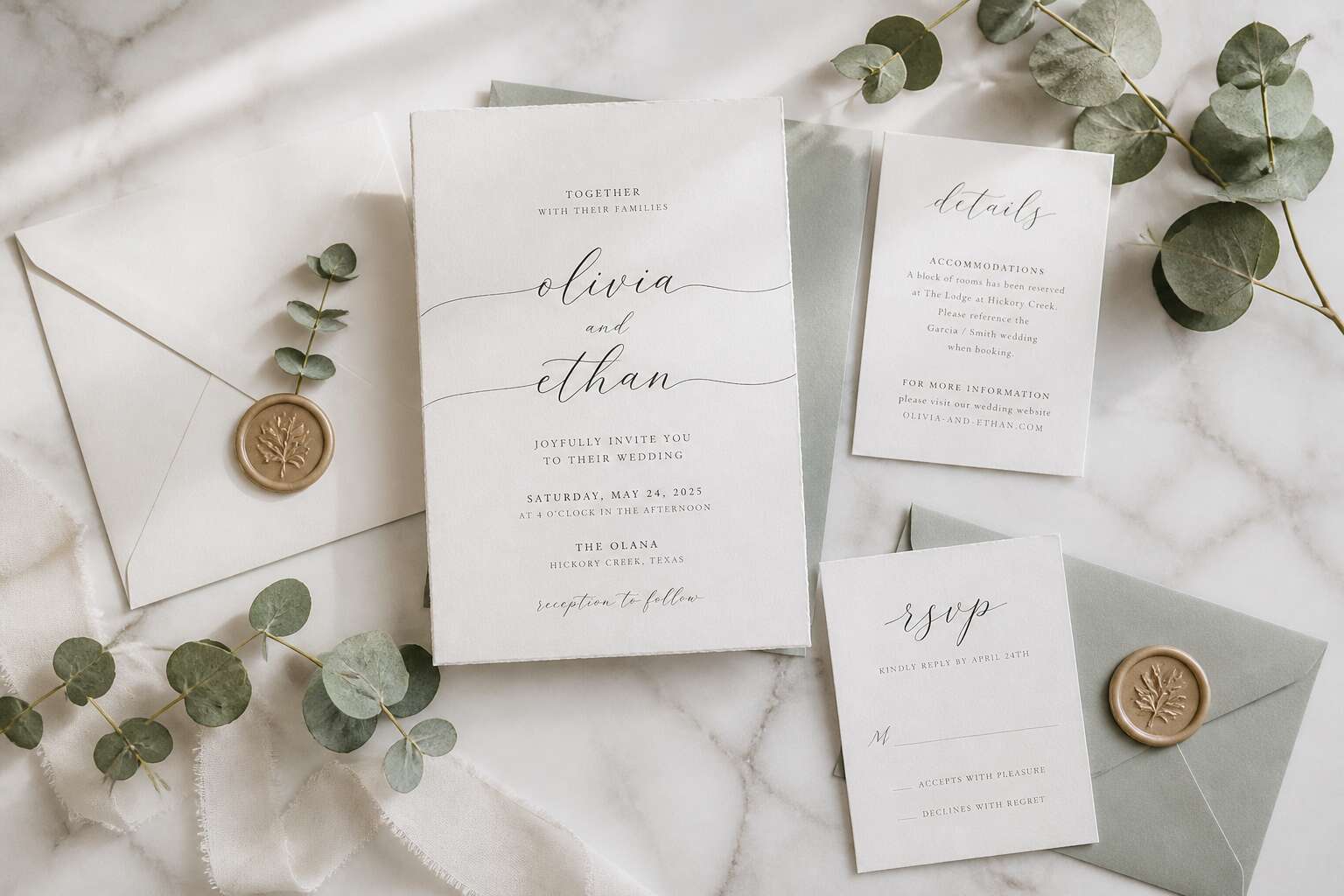
Trending Styles and Aesthetic Directions
Minimalist Modernism
Minimalist modernism favours reduction. It leaves only the essential elements. For a new wedding invitation card design, this means white space, precise typography, and one accent colour.
South African couples often choose this direction for its directness. The paper texture carries the design. The ink stays minimal.
- Thin line borders or none
- One sans serif typeface
- Muted earth tones or monochrome
That clarity feels calm and deliberate. It suits a wedding with no excess.
Vintage Romance Revival
Vintage Romance Revival is a deliberate reclamation of craftsmanship, not a retreat into nostalgia. For a new wedding invitation card design, this style pulls from Victorian etching, Art Nouveau curves, and hand-pressed paper. South African couples are drawn to its tactile richness, especially those hosting heritage weddings in Cape Dutch manor houses or Karoo farms.
The key is balance. Too many flourishes overwhelm. The best designs use one ornamental motif, like a botanical border or a wax seal, and leave the rest plain. This gives the card a sense of history without making it feel outdated.
Consider these typical elements:
- Layered textured cardstock with vellum overlays
- High contrast serif typefaces
- Watercolour washes in dusty rose, ochre, or sage
Each component creates a slower, more intimate reading experience. That is the point! In a digital age, a beautifully imperfect card becomes an event. This is what makes this new wedding invitation card design personal rather than generic.
Bold Typography Statements
While vintage romance leans on texture, bold typography strips everything back to raw letterforms. Some invitations whisper. Others announce themselves before the envelope is even opened. This is the loudest new wedding invitation card design direction right now, and South African couples are embracing it.
The concept is simple. Let the letters carry the entire mood. A single word stretched across the card face, set in a heavy sans serif or a sharp condensed grotesque. No imagery. No borders. The type becomes the artwork.
This new wedding invitation card design approach reads instantly. Guests grasp the tone in seconds, whether industrial, urban, or modern. Designers often pair it with:
– Foil-stamped oversized initials
– High contrast display faces
– Asymmetric type stacking
The result is a direct, confident card that refuses to be ignored.
Sustainable and Eco-Friendly Materials
“We have clients asking what happens to the card after the wedding,” says Cape Town stationer Anke Meyer. “That question changes everything.” It is reshaping the new wedding invitation card design landscape. Recycled cotton paper, sugarcane fibre, and pulp from invasive alien plants are replacing glossy imported stock.
These materials carry their own texture. A card pressed from waste banana bark feels different in the hand. It has depth, variation, and a slight irregularity that machine-perfect paper cannot replicate.
Printers are responding with vegetable based inks and waterless processes. Some studios now offer:
- Wildflower seed paper that guests can plant after the wedding
- Locally sourced kozo and mulberry papers
- FSC certified cardstock with no plastic lamination
This new wedding invitation card design direction does not ask couples to sacrifice elegance. It anchors the message in physical reality. The material’s origin starts the conversation before the first word is read.
Personalization and Customization Options
Monogram and Crest Design
Every love story has a cipher. The monogram, once reserved for aristocratic wax seals, now anchors the most personal new wedding invitation card design we create. Couples are crafting a bespoke emblem that whispers their shared history.
For a Cape Town couple, we interlocked their surnames with a subtle protea flower. Another merged a Scottish clan lion with a Nguni shield pattern. The most requested features include:
- Interlocked initials with a custom line drawing
- Heraldic crests reimagined with modern geometry
- Hidden symbols inside the emblem
This personalization transforms a simple card into a keepsake. When done well, the monogram becomes the visual anchor for the entire wedding suite.
Interactive Elements like QR Codes
A wedding invitation used to be a command. Now it is a conversation. Couples are embedding quiet interactive cues into their new wedding invitation card design. The QR code is the primary tool. It gives paper a function. One Johannesburg couple linked their code to a playlist created over six years. Another directed guests to a map of their favourite Cape Town corners. These details remain subtle yet effective.
Common interactive additions include:
- QR codes for RSVPs and dietary notes
- Links to a hidden video toast from the couple’s dog
- Scannable audio messages from parents
The charm lies in withholding. A good invitation reveals a little, then asks for a scan. That scan turns a passive reader into an active participant. This interaction yields warmer responses. Such restraint defines the best new wedding invitation card design.
Technological Innovations in Invitation Design
Augmented Reality Experiences
Forty percent of luxury invitation studios now offer augmented reality experiences. This new wedding invitation card design places a video inside a printed card. When a guest aims a phone at a designated watermark, the footage appears above the paper. The effect is precise and quiet. Faces emerge from the surface, then vanish when the phone moves away.
The setup requires exact markers. Designers hide patterns that trigger only at certain angles. Low light or a slow network breaks the interaction. Yet when it works, the digital layer feels physical. Guests keep the card to revisit the moment. A recent study showed that AR invitations hold attention for three times longer than plain ones. I find that statistic fitting for a design that moves!
Video Invitations Embedded
Some couples now commission a new wedding invitation card design with a screen sewn into the cover. A thin film plays a short movie when the card opens. The battery supports about thirty viewings. The light from the screen falls on the hands holding it. Guests in Johannesburg and Cape Town have begun keeping these cards on shelves long after the wedding day. I have watched one pass from hand to hand at a wedding in Durban, each person holding it a little longer than the last.
The embedded video removes the phone from the experience. There is no watermark to scan and no network to wait for. The film lives inside the paper. The card becomes a playback device. This requires careful sourcing of electronic components and a printer who understands both paper and circuitry.
Options include:
– A 90 second film loop with sound
– A silent montage with captions
– A recorded voice message from the couple
Each option changes the mood of the card entirely.
Laser-Cut and Embossed Details
Laser cutters have given the new wedding invitation card design a filigree precision that embossing alone cannot match. In Cape Town studios, couples request intricate patterns that mimic lace or protea petals. The cutter removes paper in fine lines, leaving negative space that changes with the light. Embossing then presses shapes upward from the reverse side, creating a raised landscape beneath the fingers. The two techniques work in tandem.
One can order a card with a monogram that rises from the surface while the surrounding border is cut into openwork. Another uses embossed dots to suggest a constellation, with laser cut stars scattered across the cover. The result is a card you want to hold at an angle.
I have felt the relief of a flower petal on a card from Durban, and it made the invitation feel like a monument to the day itself.
Materials and Finishes That Make an Impact
Textured Paper Stocks
The weight of the card in your palm sets the tone. In South Africa, where the light catches everything, the texture of the paper becomes a critical detail. For a new wedding invitation card design, choosing the correct stock is a decision. It is the thrum of fibre beneath your fingers.
Consider how a rough cotton deckle edge softens the harsh afternoon sun, or how a smooth, silk-laid finish retains its coolness. When sourcing textured paper stocks, I always feel for the grain. You want a surface that invites a second touch.
- Linen sheets offer a subtle, woven depth.
- Handmade papers carry irregular, organic flecks.
- Heavy felt stocks provide a plush, velvety grip.
Each texture alters the pace of the reading experience, turning the simple act of opening an envelope into a deliberate ritual.
Foil Stamping and Edge Painting
In the quiet of an August afternoon, the highveld sun casts a particular glare. Yet a single sheet of black cotton paper, struck with a shard of copper foil, turns that glare into a ceremony. Foil stamping, a process of heat and pressure, leaves behind a metallic ridge that catches every stray beam. I have seen these letters rise, hard and bright, only to refuse the sun with a haughty stillness!
Edge painting, meanwhile, offers a quieter magic. The pigments applied along the cut edges of the card, visible only when the envelope is opened, turn a simple deckle into a visible line of colour. A deep oxblood or burnt amber along the side of a new wedding invitation card design becomes a secret, a promise made before the first word is read.
When choosing finishes, consider:
- The metal’s weight, as copper or silver dictatetheir own mood.
- The opacity of the edge paint, as translucent washes fade while dense pigments remain.
These elements combine into ritual, a deliberate poise against the sun’s intrusion.
Translucent and Acrylic Invitations
Acrylic invitations reject the softness of cotton paper entirely. A clear sheet, laser-engraved with names, catches the highveld light and throws it across the table. Frosted acrylic dulls that glare instead. The material stays cool to the touch and carries an architectural precision.
Translucent vellum layers over a printed backing sheet, so text appears through a milky haze. Angle the card, and details sharpen or disappear. I have watched guests tilt these cards repeatedly, chasing legibility.
- Acrylic suits minimalist designs where the material itself is the decoration.
- Vellum softens bold typography that would shout on plain cotton.
Both expand what a new wedding invitation card design can accomplish with light, layering, and movement.
Wax Seals and Ribbon Accents
Nearly 60% of couples say a wax seal makes an invitation feel like a keepsake. I have yet to see a guest resist running a finger over that pressed emblem! It still carries weight in a new wedding invitation card design.
Wax seals offer texture and ritual. A deep burgundy seal against a cream envelope invites the recipient to pause before opening. Ribbon accents add movement. A silk ribbon threaded through a slit or tied into a bow gives the card a tactile welcome.
- Metallic wax for formal evening weddings
- Matte wax for rustic vineyard settings
- Linen ribbon for coastal celebrations
The seal and ribbon guide the hand without overwhelming the eye. Together they transform a flat sheet into a layered object of anticipation.
Navigating Cultural and Seasonal Inspirations
Destination Wedding Themes
Destination weddings are a glorious exercise in pretending your guests enjoy paying for a flight to a place where the weather might betray you. When it comes to the new wedding invitation card design, cultural and seasonal inspirations demand more than slapping a palm tree on the front. You need to consider the monsoon that arrives uninvited, or the fact that a traditional Korean robe might not translate well to a beach ceremony in Cape Town. I have seen invitations that mixed cherry blossoms with a winter solstice theme, which is a bold move for a couple who clearly never checked a calendar!
Seasonal cues offer a practical anchor. A summer wedding in Durban calls for bright, breathable paper, while a winter affair in the Winelands begs for deeper hues. Cultural elements require research, not assumption. For example, using a specific motif that holds sacred meaning in one community could be a faux pas. So, here is a quick checklist for the brave:
- Verify the lunar calendar before you print
- Match the color palette to the actual season, not the Instagram filter
- Consult a local expert for cultural symbols
The best new wedding invitation card design navigates these pitfalls with a wink. It acknowledges the chaos, embraces the local vibe, and still manages to look stunning on a mantlepiece.
Seasonal Motifs and Florals
Seasonal motifs and florals are where invitation design proves it owns a calendar. A new wedding invitation card design featuring sunflowers in July might charm a Northern Hemisphere couple, but in Johannesburg it simply announces you have no idea what winter means. I have seen December invitations adorned with English snowdrops, poetic only for a wedding in Reykjavik.
Look at what actually blooms when your wedding happens. Western Cape winter weddings can lean on fynbos that thrives in the rain. Summer ceremonies in KwaZulu-Natal have tropical foliage to draw from.
Consider these pairings:
- Proteas for a January celebration that refuses to apologise for the heat
- Yellowwood branches for an autumn affair
- Dried grasses for a winter wedding embracing the bare landscape
- Arum lilies for spring, when they are actually in season
A new wedding invitation card design that pairs the right flora with the right month shows attention without shouting. The couple who sends a peony in the middle of a Cape Town drought is simply asking for commentary.
Cultural Fusion Designs
Cultural fusion designs are where a new wedding invitation card design stops being a template and starts behaving like a love letter to two lineages. I once reviewed a suite that blended Zulu beadwork patterns with Portuguese azulejo tiles. It did not feel decorative. It felt like a negotiation, and that is exactly what marriage is!
Some couples merge surnames, others merge visual languages. For a Cape Town couple with Indian and Xhosa roots, consider weaving paisley and isicholo shapes into the border. For a Joburg wedding uniting Afrikaans and Chinese families, pairing rooibos toned paper with calligraphy that honours both scripts works beautifully.
- Work with a designer who understands both cultural vocabularies
- Print on cotton rag paper to mirror traditional fabric textures
- Use colour to signal ceremony dress, not just the stationery
Seasonality still matters here. A new wedding invitation card design that pulls from both cultures but ignores the month will feel like a museum piece. Fusion should never read as confusion.
Religious and Traditional Symbolism
Every symbol on a new wedding invitation card design carries a thousand years of collected meaning. In South Africa, where faith and season intertwine, a Hindu couple might request an auspicious wedding date, and the invitation must honour that lunar calendar. A Christian couple may want to include the Ichthys or a quiet cross beside the names. These are not stylistic flourishes. They are promises.
The season changes the visual language. A winter wedding in Johannesburg calls for charcoal and amber, a Cape Town summer wedding for light blues and botanical greens. Ink, fibre, and card weight respond to the month. Consider these elements:
- Use sacred geometry sparingly, as white space lets symbols breathe.
- Respect fasting periods when planning print and delivery dates.
- Match the envelope liner to the liturgical colour of the season.
The best invitation never competes with tradition. It becomes the threshold.

0 Comments