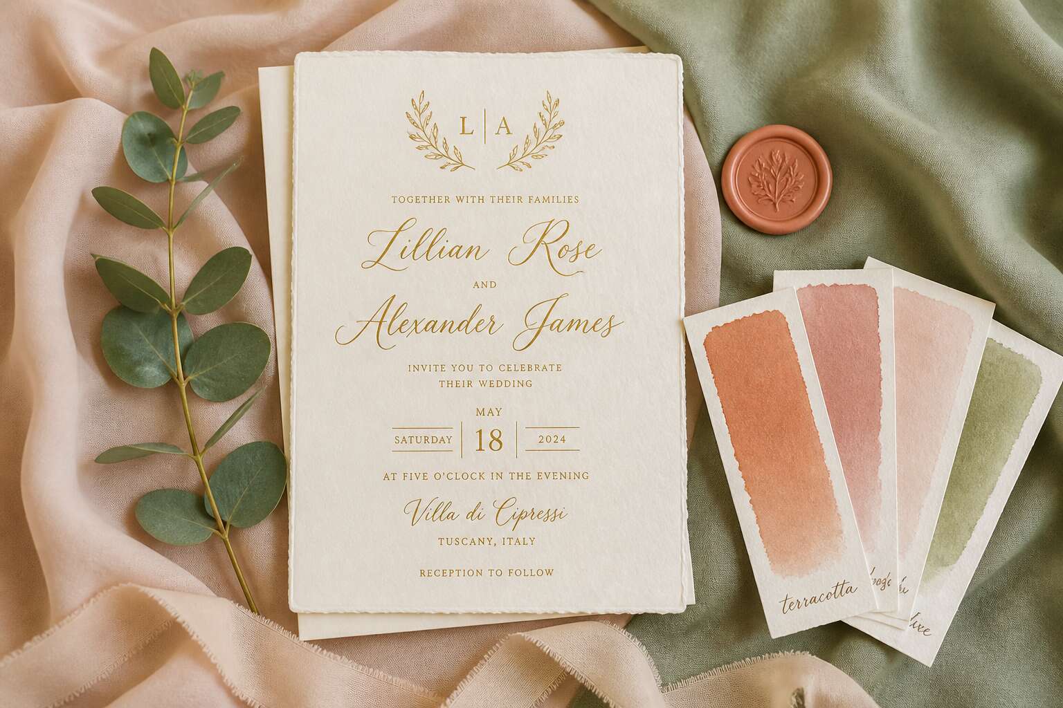
Understanding the Power of Color in Wedding Invitations
The Emotional Impact of Color Choices
Research indicates that up to 90% of first impressions are formed by color alone. A wedding invitation with color palette choices sets the emotional tone before the envelope is even opened. Soft blush conveys tenderness, while deep forest green implies stability.
I have watched couples choose shades based on their own narrative rather than passing trends. A burnt orange reflects a Highveld sunset’s warmth, and pale lavender suggests quiet devotion. These colors shape how guests feel about attending your celebration.
- Terracotta represents warmth and connection
- Cornflower blue provides a sense of calm
- Burgundy adds intimacy and depth
Every hue communicates something specific. The right palette turns a simple card into an emotional prelude to your wedding day.
How Color Sets the Tone for Your Wedding
Pull a wedding invitation with color palette from its envelope and you have already given your guests a lesson in geography. A palette of sun-bleached sand and saltwater blue places them on the Cape coast. Charcoal and burnt sienna suggest the Karoo at dusk. This is not decoration; it is orientation. The chosen hues create a physical sense of place, anchoring the celebration in a specific landscape.
Light changes everything here. On a bright Highveld afternoon, pale colours recede while deeper tones hold focus. For an evening function, saturated jewel shades keep the card readable under warm candlelight. Test your palette in different conditions, because the paper will respond to the room.
- A single dominant colour gives direction.
- One supporting shade carries the visual weight.
- A small accent colour draws the eye to key details.
The result is a tactile preview of your wedding day, a quiet briefing on what to expect.
Color Theory Basics for Brides and Grooms
Before you settle on a wedding invitation with color palette, study the mechanics of the colour wheel. Hue defines the base name, saturation controls intensity, and value measures lightness against the paper. These three variables interact in predictable ways.
Complementary hues, such as violet and gold, produce visual tension. Analogous hues, such as teal and sage, produce a quiet progression. Neither is superior, but each changes how a guest reads the typography and the border.
For a practical checklist:
- Hue: the dominant family (e.g., terracotta, indigo).
- Saturation: how strong or muted that family appears.
- Value: the contrast between the ink and the card stock.
The lighting of the venue alters perception. A pastel that works in daylight may disappear under candlelight.
The Role of Cultural Significance in Color Selection
Almost every South African wedding invites the ancestors through colour, yet few couples decode the language they send. A wedding invitation with color palette carries more than aesthetic weight; it registers lineage, geography, and communal expectation.
Power emerges from shared recognition. When isiZulu families see indigo, they recall royal protocol. When Cape Malay guests note green and gold, they anticipate joyful ceremony. Cultural significance transforms a card into a social contract.
- Xhosa: white and ochre for purification and earth.
- Afrikaner: navy and rust for resilience.
- Indian South African: crimson and turmeric for fertility.
Thus, a wedding invitation with color palette negotiates belonging. It tells elders that their customs are honoured, and it reminds peers of collective memory. Colour, in this light, is not decoration but diplomacy.
Timeless Color Palettes That Never Go Out of Style
Classic White and Gold Elegance
White and gold remains the most requested pairing in our studio, and I understand why. White carries the hush of a blank page, the quiet before vows are spoken. Gold holds light the way memory holds a first glance. Together they form a wedding invitation with color palette that feels less like decoration and more like a declaration of permanence.
There is a discipline to this palette. The white must be warm, never clinical. The gold must be subtle, never gaudy. When we balance these two tones, the result is a piece that will still feel correct in thirty years. I have seen vintage invitations from the 1950s that use this exact combination. They do not age. They simply wait.
For those planning a winter or evening ceremony, this palette works especially well. It catches candlelight. It mirrors the glow of a reception hall after sunset. For a South African wedding in the Cape winelands, where the afternoon heat bleaches the sky, white and gold offer a crisp counterpoint to the landscape.
When we design a wedding invitation with color palette, we often rely on these tonal foundations:
– Warm ivory as the base, never stark white
– Metallic gold for the letterpress or foil detail
– A soft champagne background for the inner panel
– A matte finish to keep the gold from overpowering the paper
Each element serves a purpose. The ivory softens the contrast. The gold draws the eye to the couple’s names. The champagne adds depth without stealing attention. This is not a flashy approach. It is a precise one.
I will say this plainly: few choices feel as final as a white and gold invitation. The combination suggests ceremony, not celebration alone. It promises that the day will be orderly. It tells guests to expect something considered.
That is why I keep returning to this palette. Not because it is safe, but because it is exact. A wedding invitation with color palette rooted in white and gold does not try to convince you. It simply is.
Romantic Blush and Ivory Combinations
Blush and ivory carry a different kind of permanence than white and gold. This palette offers warmth without formality. It belongs to morning ceremonies, to soft light through a Cape Town window, to petals still cool with dew.
A wedding invitation with color palette built on blush and ivory feels intimate rather than formal. The blush must stay dusty, never candy pink. The ivory must remain warm, never yellow. When balanced, these tones create a sense of quiet romance that photographs beautifully against the fynbos or the ocean.
Consider these combinations for your stationery:
- Dusty blush for the main text, ivory for the background
- Ivory card stock with a blush envelope liner
- Blush floral illustrations with ivory letterpress
Spring and summer weddings benefit most from this approach. It does not compete with the landscape. It simply belongs there. Couples who want a wedding invitation with color palette that feels tender yet grounded will find blush and ivory a reliable foundation.
Chic Black and White Sophistication
Some couples find that color is not a requirement for elegance. A wedding invitation with color palette built on black and white carries a different kind of weight, one that feels both bold and restrained. The pairing works because it relies on structure and typography rather than hue. It does not whisper like blush. It speaks with a quiet authority that demands attention.
The contrast between the two tones creates a crispness that is difficult to replicate with other shades. Black ink on a heavy white cotton stock feels substantial in the hand. The tactile experience matters. A letterpress impression adds depth, making the letters catch the light at certain angles. This approach works beautifully for evening weddings, winter celebrations, or any couple who appreciates minimalism without austerity.
Consider these variations for a striking result:
Black text on a pure white card
White foil stamping on a matte black envelope
A charcoal border framing a white inner panel
The landscape of the Cape Winelands, with its stark mountains and dramatic skies, provides a stunning backdrop for this palette. The stationery does not need to match the flowers or the decor. It exists as its own element. I have seen couples pair this aesthetic with silver cutlery and bare branches, creating a scene that feels editorial yet deeply personal. A wedding invitation with color palette this decisive tells guests that the event will be curated with intention. There is no room for hesitation. The absence of color becomes the statement.
Sage Green and Eucalyptus Neutral Tones
The longevity of a wedding invitation with color palette depends on its ability to hold meaning beyond the season. Sage green and eucalyptus neutral tones offer that endurance. They evoke the Cape’s indigenous scrubland, where resilience and softness coexist. This is not a trend. It is a recognition that calm colors carry emotional weight.
Eucalyptus brings a subtle aromatic suggestion without being literal. The palette works because it aligns with the muted greens and dusty whites of the winter rainfall region. For South African weddings, it feels both familiar and refined.
- Sage green text on recycled cotton paper
- Eucalyptus sprigs pressed into the envelope liner
- Neutral beige envelope with a sage wax seal
These choices feel intentional. A wedding invitation with color palette like this signals that the event will unfold slowly, with attention to detail.
Navy Blue and Silver Glamour
Navy blue carries a quiet authority that few colours can match. Silver, in contrast, brings a reflective brightness. Together, they form a wedding invitation with color palette that feels grounded and elevated, suited to evening celebrations or winter receptions in Johannesburg. Each shade respects the other’s role without competing for attention.
- Navy deckle-edge card with silver foil names
- Silver-lined envelope with navy calligraphy
- Navy wax seal stamped with a silver monogram
The contrast is functional, not ornamental. It gives the eye a clear path from names to date to venue. Silver catches candlelight during evening receptions, while navy provides depth in any lighting. I have yet to see this combination look misplaced in a venue. This is a wedding invitation with color palette that holds its own over time.
Trending Color Palettes for Modern Weddings
Earthy Terracotta and Rust Tones
Terracotta and rust tones are reshaping modern wedding stationery. These hues combine the warmth of South African sunsets with the richness of the Karoo landscape. When you design a wedding invitation with color palette, these earthy shades create an immediate sense of grounded intimacy. They pair beautifully with textured paper, like cotton or recycled stock.
Consider how these tones shift under different lighting. Terracotta feels vibrant in daylight, while rust deepens into a cozy evening mood. Many couples choose this palette for autumn weddings, but it works year-round in our climate. The versatility is remarkable! One practical approach I recommend:
- Use terracotta as the main ink color.
- Layer rust with soft cream for contrast.
- Add a hint of olive green for depth.
A wedding invitation with color palette like this avoids the starkness of pure white and the heaviness of black. It feels current yet timeless.
Bold Jewel Tones for Statement Invitations
Deep color does more than decorate paper. It changes how guests perceive the entire event. In my years designing invitations, I have watched bold jewel tones, from sapphire to ruby, gain steady traction across South Africa.
Sapphire blue invitations with silver foil have an heirloom quality before the envelope is opened. Ruby red shifts from romantic to regal depending on the cardstock. Amethyst purple works best with matte finishes.
- Sapphire pairs with pearl white
- Emerald demands gold accents
- Amethyst prefers silver or charcoal
Each combination alters the mood entirely. A wedding invitation with color palette built on jewel tones signals an evening of grandeur, not a casual gathering. The density of the ink does the work.
Monochrome Magic: Single Color in Different Shades
Monochrome palettes are rewriting the rules of a wedding invitation with color palette, proving that one hue, explored across its full spectrum, creates a depth that multicolour designs cannot touch. In my experience with South African couples, this approach offers a quiet confidence. The eye moves from a pale watercolour wash to a deep ink precise line without ever leaving the same family of colour, which produces a cohesive, curated rhythm.
This style thrives on texture. A wedding invitation with color palette built on a single colour demands interest from the materials themselves.
– Soft-touch lamination for the outer card
– A smooth, uncoated stock for the main insert
– A brushed metal foil for the monogram
– A heavy, deckled edge for the reply card
I have found that varying the finish is the only way to give a single shade its full dimension. A dusty blue invitation feels ephemeral on cotton paper but becomes architectural when the same blue shifts to a darker slate on a gloss finish. The drama emerges from the shift in weight. It is a restraint that reads as both modern and timeless, and it allows the calligraphy or typography to become the focal point. The result is elegant, focused, and entirely memorable.
Seasonal Color Palettes to Match Your Wedding Theme
Spring: Fresh Florals and Soft Pastels
Around 80% of couples in South Africa align their wedding stationery with the season, and for spring, this means embracing the renewal happening in the natural world. Your wedding invitation with color palette choices should reflect the lighter, longer days and the first blooms of the season. This is not about generic pink; it is about the specific pigmentation found in jacaranda petals and the fresh green of new vineyard shoots.
The tactile experience of the invitation matters here. A soft, uncoated paper stock allows the ink to absorb and mimic the matte finish of a flower petal. Consider pairing a dusty miller grey with a sharp, clean white for a modern twist on tradition. This provides a backdrop that lets specific floral accents, like a painted protea or a delicate sprig of fynbos, take center stage without overwhelming the design.
– Use a base of ivory or soft parchment for the main card.
– Layer in a single accent color only, such as a muted lilac or butter yellow.
– Employ a bold, dark typeface for names only to anchor the lightness of the palette.
– Reserve the pastel shades for the envelope liner or a vellum wrap.
This approach creates a cohesive look where the materiality of the paper does the heavy lifting. You are essentially building a sensory preview of your venue, whether that is a garden estate in Constantia or a beachside setup in Camps Bay. The goal is to make the recipient feel the spring breeze before they even open the envelope, establishing a tangible connection to your specific day.
Summer: Vibrant and Sunshine-Inspired Hues
In South Africa, summer weddings arrive with high sunlight and saturated skies. The wedding invitation with color palette for this season should echo that intensity, using citrus golds, deep coral, or electric turquoise. These hues demand attention from the first glance. A matte card stock softens the contrast while retaining pigment brightness.
Consider a palette inspired by a Highveld thunderstorm breaking into bright sunshine. I have seen this pairing work. Pair a strong mango orange with a cool slate blue. Add sun-washed yellow for highlights. The paper’s texture becomes crucial under harsh light, so choose one that absorbs rather than reflects.
- Citrus gold for accents
- Deep coral for primary text
- Turquoise for decorative borders
This approach ties the invitation to the season. When you hold it, the colors create a sense of warmth and celebration. The wedding invitation with color palette is your first opportunity to set that sunny mood!
Autumn: Warm and Cozy Earth Tones
Autumn weddings in South Africa trade bright sun for softer, golden light. The wedding invitation with color palette shifts to warm and cozy earth tones that mirror the season’s quiet intensity.
Think ochre, burnt umber, and muted olive. These colors feel grounded without being dull. A textured recycled paper adds depth, catching light unevenly. That physical quality matters more than you think.
- Ochre for background washes
- Burnt umber for main lettering
- Muted olive for accents
I have seen this same palette turn a simple card into a tactile experience. It works because the colors stay humble, letting texture lead. What a satisfying shift from summer’s bold extremes!
Winter: Icy Blues and Crisp Whites
Winter in South Africa arrives with a peculiar clarity. The air thins, the light takes on a silver cast, and gardens lose their summer saturation. A wedding invitation with color palette drawn from icy blues and crisp whites mirrors this season of surfaces and pauses.
- Frost blue for background washes
- Crisp white for primary lettering
- Silver foil for fine line details
The palette succeeds through restraint. Too many shades will dilute the effect. The colors sit close in warmth but far apart in value, and that distance creates a quiet tension. Guests notice it when they tilt the card toward the winter light, catching the interplay between matte paper and reflective foil.
Tropical Escapes: Bold and Exotic Palettes
The tropics do not whisper. The palette announces a wedding that is saturated, humid, and alive. Choose painted colors from the landscape: lagoon teal, coral pink, palm leaf green. These tones need no explanation.
A wedding invitation with color palette drawn from the tropics works best with high contrast. Limit yourself to three dominant shades. Let one carry the background, one carry the typography, and one appear in a foil stripe or a border.
Order your palette by visual weight:
- A deep base, such as teal or ocean blue
- A vivid accent, such as coral or mango
- A warm neutral, such as sand or honey
This sequence creates a natural hierarchy. Guests first register the base, then the accent, then the details. The card becomes a small preview of the wedding, a promise of dense floral arrangements, bright linens, and a celebration that does not cool down after sunset.
Practical Tips for Pairing Color Palettes with Invitation Elements
Choosing the Right Paper and Ink Colors
Choosing the right materials for your wedding invitation with color palette involves more than matching swatches. The paper surface and ink finish shift how your chosen hues appear under light, and they affect the tactile experience of your guests. Thick cotton stock absorbs color differently than smooth linen, so test your palette on each option.
For ink colors, consider opacity and sheen. Metallic gold reads as elegant on cream, but it may overwhelm a busy pattern. Matte charcoal provides contrast without competing with muted tones. Use a simple test kit before committing.
- Match ink darkness to paper weight.
- Use translucent inks on textured boards.
- Pair warm palettes with ivory paper.
Every choice, from deckled edges to foil stamping, alters the mood of your wedding invitation with color palette. A winter wedding in Johannesburg needs different materials than a beach ceremony in Cape Town, so let the climate guide your final selections.
Matching Your Palette with Typography and Fonts
A single font can change how guests perceive your chosen hues. Typography carries weight, and the wrong typeface will fight your palette instead of supporting it. When you design a wedding invitation with color palette, consider the voice of each letterform. A heavy serif adds gravitas to deep burgundy. A light sans-serif lets pale blush breathe.
Script fonts pair well with watercolor florals, but they become unreadable when set in shimmering ink. I tell couples to test font weights against their paper samples. Does the headline hold contrast? Does the body text remain legible at 10pt? Harsh South African sunlight washes out delicate hairlines.
Here are three practical pairings to try:
– Pair thin geometric fonts with muted neutrals
– Combine bold italic serifs with jewel tones
– Use hand-lettered styles for earthy palettes
Your choice of typeface should match the mood of your wedding invitation with color palette, not overpower it.
Incorporating Florals and Botanical Accents
A single protea stem can define your wedding invitation with color palette. South African fynbos offers texture that printed botanicals cannot match. Local blooms guide your ink choices and make the design feel seasonal.
Botanical accents should echo the paper’s undertone. Sage greens pair with cool whites. Terracotta petals need warm cream bases. The flower must never compete with the typeface! I tell couples to lower the opacity of their floral artwork. This shows which hues truly dominate. The eye reads the flower first, then the words. If contrast fails, the invitation feels unbalanced.
Consider these elements when placing botanicals:
- Vein density on each leaf
- Petal scale relative to the headline
- Stem direction leading toward the date
Every drawn stem and petal should serve the overall composition. A wedding invitation with color palette works when the botanical accents support the chosen hues without stealing attention from the text.
The Art of Foil Stamping and Metallic Finishes
Foil stamping transforms a flat design into something you want to touch. A wedding invitation with color palette gains another dimension when the metallic finish talks to the base hues. Warm copper on terracotta feels baked. Cool silver on sage feels dew-kissed. I have learned that the paper’s texture matters as much as the ink. Metallic finishes behave differently on cotton rag versus coated stock. That is not a design bias; it is physics.
Consider the finish’s opacity. A matte gold sits shy, while a mirror chrome shouts. For a muted palette, choose a satin foil. For a bold palette, high-shine works. The local market offers impressive options from Cape Town suppliers, though I always test under yellow light. Restaurants and wedding venues love warm bulbs.
- Brass: rustic, pairs with terracotta
- Platinum: architectural, pairs with grey
- Rose gold: romantic, pairs with blush
The metal should frame the palette, never overpower it.
Where to Find Inspiration for Your Wedding Invitation Color Palette
Bridal Magazines and Online Galleries
The right wedding invitation with color palette rarely appears in a flash of inspiration. It surfaces through pages and pixels, through spreads and online scrolling. Bridal magazines offer a curated starting point, pairing paper textures with seasonal hues in ways that feel aspirational yet achievable. Online galleries present a public collection of real celebrations, where couples have already matched stationery to their venue, attire, and mood.
A few sources stand out:
- Boutique stationery websites showcasing their latest collections
- Real wedding features on South African wedding blogs
- Designer portfolios on Instagram and Pinterest
I find the strength of these resources rests in their range. A magazine might introduce you to a bold jewel tone, while an online gallery shows how that same shade appears on textured cotton paper in natural light. Both avenues refine your wedding invitation with color palette without imposing a single direction, and that freedom is the reward!
Social Media Platforms: Pinterest and Instagram
Pinterest and Instagram offer an overwhelming volume of visual input. You open one app to search for a wedding invitation with color palette, and ninety minutes later you have seen twenty shades of blush and a questionable trend involving dried citrus. The trick is to search with intent. Look for hashtags like SAWeddingInspo or follow local stationery designers who photograph their work in natural light.
A useful approach:
- Pin full invitation suites, not just single cards
- Screenshot colour pairings that appear repeatedly in real wedding feeds
These platforms reward obsessive browsing. Every scroll offers a new direction for your wedding invitation with color palette, but only if you curate ruthlessly.
Custom Design Services and Stationery Experts
Yet the algorithm has its limits. Custom design services and stationery experts offer a direct path to a wedding invitation with color palette that reflects your specific history. A skilled designer will ask about your venue’s architecture, the weight of your dress, even the way your partner laughs. They translate these intangibles into ink and paper.
In South Africa, independent studios from Cape Town to Johannesburg provide consultation sessions where you can touch cotton rag boards and see how metallic inks shift in natural light. I once watched a Durban designer mix a palette from a single protea petal. That level of personalisation explains why many couples hire a stationery expert before they book a venue. One conversation often reveals more than a hundred saved posts.

0 Comments