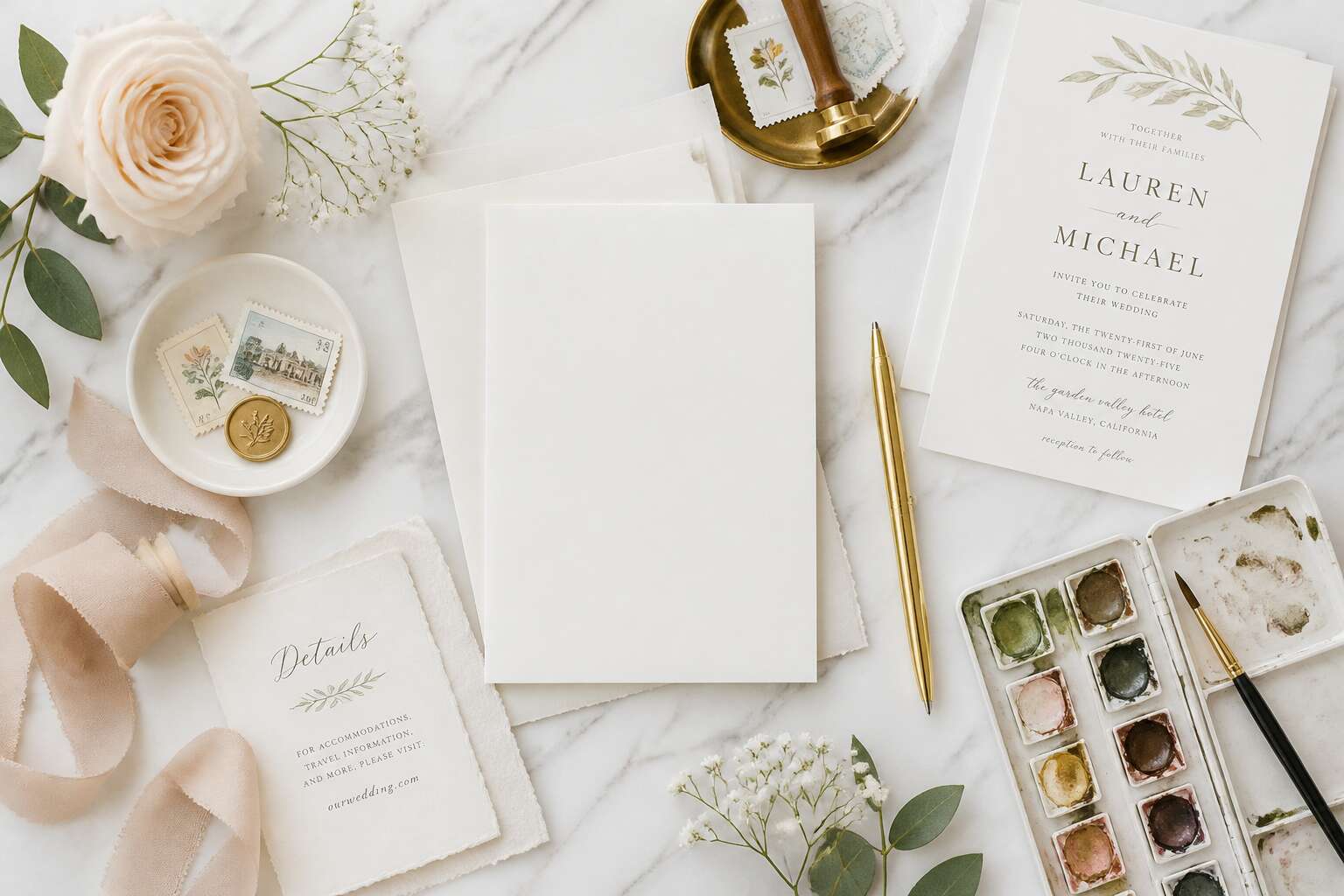
Setting the Vision and Theme
Defining Your Wedding Style
The initial decision in wedding stationery is not colour. It is the essence your ceremony brings into a room. I have seen couples debate serif fonts while ignoring what their day will hold. To learn how to design wedding invitation card, you must first identify your wedding style.
Think of the place and hour. A winter chapel with stone floors. A summer veld under low sun. Write down the objects you want present: old books, dried flowers, iron candlesticks. This list becomes your theme.
- Gothic romance with heavy black lettering
- Rustic earthiness with recycled paper
- Vintage mourning with sepia photographs
Each direction changes the invitation’s physical properties. Paper weight, edge style, ink colour. The theme is your constraint in how to design wedding invitation card. It tells you whether to use copperplate or a rough brush stroke. Settle this vision before any sketch! Then every line serves the same purpose.
Choosing a Color Palette
Seventy percent of couples admit their stationery budget expands after the first consultation. That figure climbs when the vision lacks a fixed palette. Setting the theme before choosing colours prevents overspending.
Your theme guides every swatch. A coastal wedding in Camps Bay demands muted blues and sand tones. A Highveld autumn wedding calls for burnt orange and deep plum. The palette must mirror the physical world you will create. I have watched couples try to blend forest greens with neon coral, and the result never holds.
- Charcoal and bone for formal evening ceremonies
- Terracotta and ochre for bushveld celebrations
- Dusty rose and sage for garden receptions
When you know how to design wedding invitation card, colour becomes the second decision, not the first. The theme constrains the palette. Every later choice becomes easier!
Selecting Typography That Speaks
Most couples spend under five minutes choosing their wedding typography, then wonder why the finished cards feel generic. The theme provides the direction. When you learn how to design wedding invitation card, you see that the vision must set the type, not the other way around. I have watched this realisation shift entire design conversations.
For a farm wedding in the Karoo, a sturdy slab serif suits the landscape. For a Cape Town city hall affair, a narrow sans-serif reflects the precision of the architecture. If you need a starting point, consider these pairings:
- An elegant high-contrast serif with a quiet humanist sans for formal evenings
- A rounded geometric sans with a handwritten accent for relaxed outdoor gatherings
The pairing must survive across envelope liners, order of service sheets, and thank-you notes. A mismatched font breaks the invitation’s internal logic. Consistency becomes the signature of a considered design.
Incorporating Motifs and Personal Elements
Before any paper is cut or ink is mixed, the vision must be defined. When you learn how to design wedding invitation card, the theme acts as the reference point. Every motif, every embossed detail, every envelope choice must answer one question: does this belong to the story of this couple? For a vineyard wedding in Stellenbosch, that might mean pressed grape leaves. For a coastal ceremony in Paternoster, a hand-drawn wave line.
Motifs should come from the couple’s real life, not from a saved folder. Consider these sources:
- A family heirloom pattern
- The shape of the venue’s architecture
- A recurring symbol from their shared travels
Personal elements should feel deliberate. A subtle monogram or a hidden date in the border gives the card quiet meaning. I have watched couples respond with surprise when these details are noticed. The vision must be strong enough to guide every decision, so the final piece feels inevitable.
Creating a Mood Board
Many couples approach the design process backwards. Consider the mood board as the reference point for how to design wedding invitation card. Collect paper samples, architectural photographs, even a pressed protea from the venue’s garden. Arrange them without judgment. The connections will surface on their own.
I have watched couples assemble boards that look scattered until a single detail, a particular shade of ocean grey, or the curve of a door handle, ties everything together. That link is the discovery. This early stage of learning how to design wedding invitation card rewards patience.
- Photographs of the venue at different times of day
- Textile swatches that echo the season
- One object, perhaps a shell or a ticket stub, that anchors the story
That object carries the most weight. It will guide decisions about texture and structure long after the board is folded away.
Structuring the Essential Information
Mastering the Wording and Etiquette
Somewhere between the first sketch and the final print lies the true structure of your invitation, a silent architecture that guests will read before they ever notice the lace or the ink. The hierarchy of names, dates, and locations must command attention without shouting. You must decide who is hosting, who is invited, and what level of formality your ceremony demands. This is where you learn how to design wedding invitation card details that actually function.
Your wording sets the temperature of the entire event. A single phrase can shift your wedding from a relaxed garden affair to a black tie spectacle. Choose each word with intention, and consider the rhythm of the sentences themselves.
– The hosts’ names, written in full.
– The request line, such as “request the honour of your presence.”
– The date and time, written out for formal affairs.
– The venue name and city, with a separate map for directions.
The etiquette here is not about perfection, it is about clarity. The response card, the dress code, and the online RSVP details should all be present but unobtrusive. These elements carry the weight of your planning, so place them with empathy for your guests. When the wording is precise, the invitation becomes a live connection, not a static announcement. That is the quiet power of a well structured card.
Organizing the Event Details
Guests rarely notice a well ordered invitation, but they always feel the chaos of a scattered one. The sequence of details should be deliberate: venue first, then time, then the response. Each block of information needs its own territory. This is the part of how to design wedding invitation card structures that most couples overlook.
– The ceremony and reception details on separate lines
– The RSVP date set apart from the main text
– The accommodation and travel links at the bottom
I always place the most urgent information near the top. The eye should never hunt for a date! Organising the event details means deciding what appears on the main card versus the insert. A map belongs on the insert. The dress code belongs near the response card. That division creates clarity, and clarity makes the invitation readable. In South Africa, where many guests travel long distances, the venue address and parking instructions deserve their own line.
Adding Accommodation and Travel Info
The essential information on a South African wedding invitation needs a clear hierarchy. The couple’s names and the date carry the most weight. Everything else supports that priority. Accommodation and travel details ask for their own territory, separate from the celebratory wording above.
Guests driving from Johannesburg to the Cape Winelands need concrete facts before they can commit. The accommodation insert should include:
- Block booking references and the final booking date
- Shuttle departure times from the hotel to the venue
- Self-drive directions, including the last tarred road
These travel details influence how to design wedding invitation card layouts more than couples expect. I have seen beautiful cards fail because the airport code sat hidden in a footer. A dedicated insert preserves the main card’s clean layout while carrying the full logistics of guest movement. The nearest airport code and transfer company name belong in that same insert!
Including RSVP and Response Card Details
RSVP deadlines are the quiet engine of your entire wedding planning machine. Every caterer, florist, and transport hire hinges on those final numbers. In South Africa, where many guests travel from other provinces, a clear response deadline is not a formality. It is a practical necessity that shapes how to design wedding invitation card decisions, forcing you to balance beauty with absolute clarity. The response card itself should be an exercise in minimal friction.
The date for replies needs to sit squarely in the guest’s line of sight. It should not live exclusively on a separate website, as older relatives may not navigate that far. Give them a physical card, a stamp pre-addressed to a chosen family member, and a single, specific date. To structure the details effectively, consider these core elements for your response card layout:
- A blank line for the guest’s name and the number attending
- Clear meal options with a tick box for pre-selected choices
- A dedicated line for song requests if you are having a live band
This setup means the card is doing the work, not the guest. A messy response card creates anxiety. A clean, structured one respects the guest’s time and confirms your own plans without back-and-forth messaging. The entire process of how to design wedding invitation card should prioritise this functional exchange, ensuring the aesthetic choices never obstruct the primary goal of getting accurate headcounts.
Handling Digital vs. Traditional Elements
Nearly 60% of South African couples now send a digital save-the-date, yet the physical invitation still anchors the entire experience. When you ask how to design wedding invitation card, the real test is deciding which details live on paper and which live on a screen. Essential information, such as the exact venue address and the dress code, must sit directly on the card. Digital elements, like a wedding website or QR code, can hold the rest, but only if the card signals their purpose clearly.
I prefer a strict hierarchy. The card carries non-negotiables; the website carries the supplementary. For example:
- Date and time, written out in full.
- Venue name and street address, not just a suburb.
- Dress code, stated without ambiguity.
Traditional pieces, like a printed map or a separate details card, still serve guests who never open the browser. Digital tools should reduce friction, not create a second puzzle. Structure the physical object so that no guest feels penalised for ignoring the digital layer. That balance is the quiet heart of how to design wedding invitation card with confidence!
Layout and Visual Hierarchy
Balancing Text and White Space
Arranging the invitation deck requires a measured eye for equilibrium. The blank spaces are not wasted; they shape the reading path. Space around the text gives the names room to land.
Visual hierarchy depends on deliberate contrast. The couple’s names need to command immediate attention, while the venue details step back. This is where layout takes charge.
- Scale sets the primary anchor.
- Positioning controls the sequence of reading.
- Alignment builds an invisible grid.
White space acts as a buffer against clutter. When balancing text with empty areas, I keep in mind that every element competes for the guest’s gaze. For anyone learning how to design wedding invitation card, that tension is the core puzzle!
Positioning the Main Event
Picture a reception desk piled with invitations. A guest sorts through them, spending seconds on each. The eye scans for a name, a date, a venue. This decision speed explains why visual hierarchy is the most functional asset in your design toolkit.
For anyone learning how to design wedding invitation card, the layout dictates the story. The couple’s names are the headline, or the main event. Everything else recedes. A strong grid places the typographic anchor at the optical center, slightly above the mathematical middle. From there, the reader travels downward, absorbing the ceremony time, the location, and the evening’s details.
Positioning works alongside scale. You might place the date in a larger serif, while directions sit in a smaller, lighter sans-serif. Alignment, whether flushed left or justified, creates a subtle, invisible architecture.
The spatial jobs for each block:
1. Names at the top to claim ownership.
2. Date and time as the prime directive.
3. Venue as the supporting detail.
4. Dress code and registry notes as the fine print.
The white space near the margins allows the focal point to breathe. The text serves as the anchor, while the blank canvas directs the gaze with quiet authority. This structural control is the quiet engine of a successful piece, guiding the eye without ever feeling forced.
Designing With Focal Points
Hierarchy works best when it feels invisible. Ninety percent of recipients will decide within three seconds whether they will attend, which means your focal points must guide them without conscious effort. In learning how to design wedding invitation card, you are essentially choreographing an eye path.
Graphic weight does the heavy lifting. A bold, oversized numeral for the date creates immediate recognition, while the venue name in a refined italic adds a secondary layer of interest. The contrast between these elements transforms a flat layout into a dimensional experience.
– The couple’s names serve as the visual anchor
– The date receives the strongest typographic weight
– The venue balances as a supporting element
– Secondary details fade into the background
Spacing between these blocks creates a rhythm. When the gap between the names and the date tightens, you create tension. When it loosens, you provide relief. We scan the names, pause at the date, then drift toward the location. This natural progression ensures nothing feels disjointed.
The blank space at the edges is not empty. It is a pressure chamber that pushes the reader’s attention inward. Grouping related information like the time and venue into one visual unit reduces cognitive load. When the eye knows where to rest, the design completes its task. The following section will examine how color accents can further direct attention.
Using Texture and Embellishments
Texture changes how the eye travels across the paper! A letterpress impression creates a shadow that shifts with the light, making the date feel carved into the card. This tactile depth matters when you are learning how to design wedding invitation card with elegance and intent.
Embellishments should reinforce the hierarchy, not compete with it. If the names anchor the design, a subtle embossed frame holds attention. If the venue needs emphasis, a thin foil line beneath it draws the eye downward.
- Foil catches light, which makes it suitable for the primary element alone
- Embossing adds depth without colour, a quiet choice for secondary details
- Deckled edges create a handcrafted feel that guides the reader
In South Africa, I have seen textured stock save a wedding invitation from a humid December afternoon. The physical sensation of the card becomes part of the experience.
Considering the Envelope Design
The envelope begins the wedding invitation experience before the inner card opens. Recipients form an opinion from the outer shell first. In South Africa, where postal routes stretch from city apartments to farm gates, the envelope endures more handling than the card itself. Weight, lining, and addressing style direct the eye inward.
When you learn how to design wedding invitation card, consider the sequence of reveals. A dark outer sleeve with a light inner card creates tension. A window envelope surrenders the surprise. The envelope’s hierarchy follows three rules:
- Hand-addressed envelopes signal a personal ceremony.
- Printed labels suggest distance and formality.
- A belly band or wax seal delays the reveal.
The envelope creates the first focal point. The card creates the second. Both should share the same margins, colour, and typography. When the outer shell and inner layout use matching proportions, the recipient reads a continuous design.
Technical Design and Production Choices
Selecting Paper Stock and Finishes
A 400gsm cotton sheet carries a solemn weight. In Durban’s humidity, a flimsy card warps before it reaches the mailbox. The stock you choose is a physical constraint. When you learn how to design wedding invitation card, this production choice decides what the guest feels upon first touch.
I have seen couples neglect this stage, only to regret the outcome. Finishes alter how light plays. A soft-touch matte absorbs the glow, while hot-foil stamping lifts metallic elements into relief. Consider these options:
- Letterpress for a deep, sunken impression.
- Foil stamping for sharp, reflective accents.
- Digital printing for cost-effective, full-colour imagery.
Each finish demands a different weight, and a savvy designer balances them. A thick, textured stock rejects a fine foil, but it holds a velvet lamination with grace. Do not trust the printer’s default; request samples for every option! The correct pairing ensures your invitation survives the post and the reception.
Working With Printing Techniques
Printing techniques translate your digital mockup into a physical object. When you learn how to design wedding invitation card, production choices decide whether the final piece matches your vision. Offset printing handles large runs with crisp consistency, while digital printing suits smaller guest lists. Thermography raises ink to create a textured effect that rivals engraving at a fraction of the cost.
Consider the limitations of each method:
- Offset lithography requires CMYK colour separation and suits flat graphics.
- Digital printing supports variable data, so you can personalise each guest’s name.
- Thermography needs thick ink coverage, which can crack when folded.
A Johannesburg printer told me that couples overlook how inks interact with humidity. Solvent-based inks dry quickly but emit fumes; water-based inks cure slower but stay safer indoors. Ask for a press proof, not a digital sample, because it shows true ink density and register. That step prevents surprises.
Sizing and Shaping Your Card
Size shapes perception before the envelope is even opened. A standard A6 card feels efficient; a square or gatefold invites slower handling. Learning how to design wedding invitation card means matching paper weight to dimensions. A flimsy stock in an oversized format reads cheap, while a thick card in a small size feels dense and precious.
Die cutting adds control. Rounded corners soften the piece, while laser cut edges reveal a motif. I have watched couples fall for a scalloped edge, only to discover the post office has other ideas. South African mail sorting machines can reject unusually shaped envelopes, which means a hand cancel fee on every single invite.
- Standard A6 or A5 sizes keep postage predictable.
- Square formats cost extra but stand out.
- Custom shapes demand manual handling.
Using Design Software and Templates
Design software turns raw paper into a planned experience, but only if you understand the production limits. Most couples begin with a template, which is acceptable. A template provides structure, and the structure is where you intervene. Adjust the grid, reposition the text, and strip away the generic flourishes before exporting anything.
In my own studio, load shedding interrupts workflows without warning. Save your progress obsessively. I keep a spare battery for the laptop, but even that runs dry. Export vector files before the lights fail. Adobe InDesign remains the standard for multilayered layouts, while Canva offers speed and Affinity Publisher offers a budget alternative. Keep your bleed at 3mm and resolution at 300 DPI.
When learning how to design wedding invitation card with templates, the technical choices become explicit:
- Export with crop marks for the printer.
- Convert all fonts to outlines before sending.
- Request a physical proof rather than trusting the screen.
The screen flatters. Paper does not.
Preparing Files for Print or Digital Delivery
Every file has a final destination. Paper demands precision while screens forgive nearly everything. South African print shops reject many RGB files at the counter, usually because the couple never learned how to design wedding invitation card files for production. The conversion process carries as much weight as the aesthetic.
Convert colours to CMYK before export, especially for deep burgundy palettes. Embed profiles and flatten transparency. Use single colour black for text to prevent muddy edges. A physical proof reveals discrepancies that screens hide.
Digital invitations follow different rules:
- Compress PDFs to under 5MB for WhatsApp and email delivery.
- Test the file on a phone screen before sending.
- Keep text selectable for calendar transfers.
The discipline of preparing digital versions requires attention to loading times and legibility at small sizes. Understanding how to design wedding invitation card files for each channel prevents late-night corrections.
Adding Finishing Touches and Wowing Guests
Introducing Foil, Wax Seals, or Ribbons
Foil reflects light across the card’s surface. Wax seals create a physical barrier that must be broken. Ribbons introduce movement when the card is lifted. These elements provide a sensory preview of the celebration. They are enhancements, not noise.
Restraint matters. Too many finishes compete for attention. Choose one or two. A single copper foil on a deep navy background works well. A cream envelope sealed with burgundy wax creates anticipation. When you consider how to design wedding invitation card, think about the hand that will hold this object.
- Break the wax seal
- Pull the card from the envelope
- Trace the ribbon’s edge
Each step delays the reading of the names. The envelope becomes a small ritual. These details speak before the ink does.
Creating a Cohesive Suite
The soul of a wedding lies within the details, a truth that becomes palpable when you consider how to design wedding invitation card. The assembly of your suite is where individual decisions become a singular, breathtaking story. This is the moment to trust your instincts and curate a tactile experience that resonates with your specific narrative. Each choice, from the weight of the paper to the textures adorning it, should feel like a deliberate stroke on a canvas.
Consider the elements that will define your suite’s character. A curated selection might include a deep-vellum belly band, a hand-painted map for out-of-town guests, or a velvet ribbon to tie the components together. These pieces work in concert with your chosen stationery, creating a cohesive whole. Sourcing local South African elements, like a sprig of fynbos pressed between layers or a hint of rooibos dye in the paper, grounds the design in a beautiful sense of place. This attention to detail turns the process of opening your invitation into a remembered moment.
The true magic of how to design wedding invitation card is in creating that unified visual identity. Your suite, from the save-the-date to the thank-you note, should feel like a single, beautiful voice. When your guests lay their eyes on the final product, they should be able to glimpse the aesthetic of the day itself. A structured minimalism, paired with a single floral watercolor, whispers sophistication. A bold, colorful pattern hints at a bohemian celebration.
This cohesive design is the final flourish, the moment where your vision becomes tangible. It is the promise of a celebration that is equally considered, a promise that your guests will feel from the very first touch. The invitation is not just a card; it is the opening scene, the first glance into the world you are creating. It holds the power to set the stage for a day that will be remembered for a lifetime, and the way you assemble it will set the tone for the beauty that is to come.
Designing Additional Inserts
According to stationery experts, nearly 70% of guests keep the entire invitation suite as a keepsake. That is why the smaller pieces tucked inside matter more than you think. When you consider how to design wedding invitation card, the main card gets attention, but the inserts add function and warmth. A perforated postcard for the afterparty or a pressed fynbos specimen in a glassine sleeve can make the envelope feel special.
Designing additional inserts is about utility with charm. Your guests need clear logistics, but they also need to feel your world. The question of how to design wedding invitation card extends to these secondary pieces. Think about what serves your specific weekend:
- A printed map of your venue’s wine farm, with the ceremony spot circled
- A card listing local coffee shops and hidden beaches for early arrivals
- A reply card that doubles as a bookmark
Each insert should echo your suite’s colour palette and typography. Do not overstuff the envelope. Select one or two pieces that genuinely help your guests. That restraint makes every element feel intentional.
Testing Prototypes and Proofing
Build a full prototype and live with it for a day. Open the envelope, pull out every insert. You will catch small annoyances, like a reply card that does not fit or a seal that cracks in transit. The physical sample changes everything.
For the wow factor, add a subtle finishing detail. A spot gloss on your names adds a quiet polish. When you truly understand how to design wedding invitation card, you see the value of restraint.
Then proof like a detective. Focus on the details:
- Read every line backwards
- Confirm all dates and locations
- Send a draft to your most critical friend
Some couples order two prototypes on different paper stocks. This final scan ensures the only surprise on the day is joy.
Budgeting for Design and Printing
Finishing touches are where taste separates from extravagance. A blind emboss along the edge adds quiet presence without shouting. True mastery of how to design wedding invitation card lies in restraint. Guests may forget the ribbon, but they will remember the weight of the card and the silence it commands when lifted from the envelope.
Budgeting demands that same discipline. Before you chase foil or a wax seal, weigh the cost of every element. South African couples can source exceptional cotton papers from local mills, often beating imported prices. Direct your funds deliberately:
- Printing technique, because it defines texture
- Paper weight, because it defines presence
- Postage, because heavy inserts inflate it
Every rand spent should carry meaning; a budget, handled well, is taste expressed in numbers.
Working With a Designer vs. DIY
There is a delicious irony in watching a couple spend a fortune on calligraphy, only to have their pages stuck together with homemade glue. A designer charges for restraint. A DIY approach charges your Saturday afternoons and possibly your relationships. I have seen a well intended craft session dissolve into a test of patience, with a hot glue gun as the referee. Before you decide, consider two elements.
– Cost. A professional knows where to source materials, saving you from expensive mistakes.
– Time. You may have weekends, but do you have the mental stamina for proofing 200 cards?
The finishing touch is not the ribbon. It is the wait. It is the quiet moment your guest pauses before opening the envelope. That pause is crafted, not bought. The weight of the paper, the resistance of the flap, these are the details that create a sigh. A DIY card can spark joy at the kitchen table, but a designer understands the architecture of anticipation. The true secret to how to design wedding invitation card is knowing what to leave out. Choose your path based on your patience, not your Pinterest feed. A Joburg couple might save thousands by printing locally, but waste it all on a designer who misses the brief. The craft is in the decision, not the decoration.


0 Comments