The Essentials of Invitation Mailing
Addressing Your Envelopes with Confidence
Handing the stack to the postal clerk can feel like a final test. Every envelope carries your names, your date, and your promises. Confidence here comes from preparation, not guesswork.
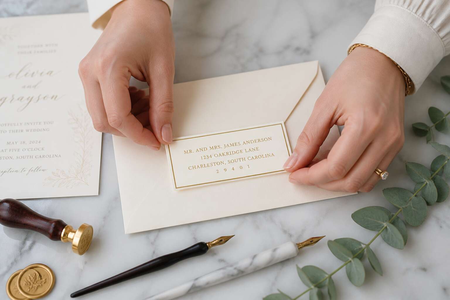
Get the basics right before you seal anything! Write the recipient’s full name on the first line, the street address on the second, and the town with postal code on the third. In South Africa, the postal code belongs on the same line as the town, not beneath it. Wedding invitation address labels keep your writing steady and your spacing consistent, even when you address fifty envelopes in one sitting.
Print clearly, align everything to the left, and leave a generous margin. Check each name twice. A single misspelling echoes louder than any font choice.
Selecting the Right Envelope Size and Shape
Choosing the correct envelope is the first physical choice your guests observe. Size must match the invitation’s weight and fold. A DL envelope suits a folded A4 sheet, while a square signals a more formal affair. Both work in South Africa, but sorting machines favour standard rectangles.
Square envelopes are striking and may incur surcharges. Rectangular formats such as DL or B6 move through the system with greater ease. I have seen heavy stock alter an envelope’s silhouette.
Common sizes:
- DL (110x220mm) for a tri-fold letter
- B6 (125x176mm) for a folded A5 card
The right proportions carry the invitation safely. Wedding invitation address labels complete that impression when sized to the envelope’s width. A label that overflows the edge undoes the care of the entire mailing. When label and envelope share their line, wedding invitation address labels become a final touch of order.
Calculating Postage and Delivery Timelines
The South African Post Office has a curious relationship with time. A wedding invitation can take three days to cross Johannesburg, or three weeks to reach a farm near Upington. Your wedding invitation address labels will not speed up the truck, but they will ensure the postal worker knows exactly where to send it. Postage calculation requires a scale, because a card that feels light might still exceed the 50g limit.
Here is what a realistic timeline looks like for local mail:
- Metro to metro: 3 to 5 working days.
- Metro to small town: 5 to 10 working days.
- Rural routes: 10 to 21 working days, depending on the moon phase (fine, that is a joke).
Postage rates change annually, so weigh your completed envelope with its wedding invitation address labels before licking anything. A mislabelled weight leads to returned mail, and nobody wants a dead invitation.
Understanding Stamps and Postal Regulations
The South African Post Office handles nearly 700 million items a year, yet one wrong stamp stalls your envelope in the sorting machine. Postal regulations demand exact postage. Ordinary stamps cover standard mail. Registered mail needs a prepaid label.
Overpaying is safe, underpaying triggers a surcharge or return. Weigh the completed envelope with its wedding invitation address labels before affixing any stamp. Machines read barcoded stamps. Hand-drawn or cancelled stamps cause rejections.
Regulations require:
- Correct postage for weight class
- Stamp on the top right corner
- No overlap with the address block
These rules are simple. Break them, and your invitation lands in the dead letter pile.
Creative Design Inspirations for Labels
Elegant Calligraphy Styles for a Timeless Look
They say a letter’s first impression is its return address, and South African couples are increasingly treating this small corner as a canvas. The classic choice remains the elegant calligraphy style. It transforms a simple label into a work of art, setting a tone of sophistication before the envelope is even opened.
Modern script fonts offer a softer, more romantic feel, while traditional copperplate styles project formality and grace. Consider the weight of the paper and the colour of the ink; they must complement your suite. For a truly bespoke touch, some designers recommend:
– Using a custom wax seal over the label for a dimensional effect.
– Selecting a subtle metallic ink like gold or rose bronze for added depth.
– Pairing a modern script with a clean, sans-serif font for the return address.
These elements work with your chosen wedding invitation address labels to create a cohesive and memorable start to your wedding stationery journey. The right typography whispers your wedding’s character before a single word of the invitation is read. It is a detail that does not shout, yet it speaks volumes to your guests, promising an event where every element is considered.
Minimalist and Modern Label Trends
Minimalist label trends are reshaping how South African couples approach wedding invitation address labels. Clean lines, sans-serif typefaces, and restrained colour palettes create quiet confidence. I have seen couples choose white labels with embossed text for a tactile effect. Others prefer translucent paper that lets the envelope texture show through. Modern trends favour negative space. A small monogram or a single line drawing adds personality without clutter. For a contemporary twist:
- Use geometric borders to frame the address.
- Opt for asymmetrical placement on the envelope.
- Select muted earth tones inspired by the Karoo.
These elements work well with kraft envelopes or recycled paper. The key is balance. Your wedding invitation address labels should feel intentional, not busy. Each choice signals a deliberate aesthetic. That is the essence of modern design. It whispers rather than shouts.
Adding Custom Monograms and Crests
Heraldry once belonged to the aristocracy. Today, a monogram on wedding invitation address labels brings a similar sense of heritage to your wedding stationery. I have seen couples use their shared initials in a serif font, paired with a single crest, a protea perhaps, to give the design a South African identity.
The charm lies in restraint. A crest need not be ornate. A single line drawing of a protea or a geometric shield adds depth without overwhelming the address. Consider these ideas:
- Combine a hand drawn monogram with a blind embossed crest.
- Choose a wax seal motif that echoes your surname’s history.
- Use a small crest on the back flap, and the monogram on the labels themselves.
These details turn functional objects into keepsakes. When your invitation labels carry a symbol of your story, the envelope becomes something worth keeping.
Themed Labels for Destination Weddings
Sixty percent of destination weddings in South Africa involve local stationery, yet many couples overlook the label itself. Themed labels for destination weddings can anchor your design to a place without shouting it.
For a beach ceremony in Plettenberg Bay, consider wave line motifs in muted blues. For a vineyard wedding in Stellenbosch, use grape leaf icons in earthy greens. The wedding invitation address labels become a visual prelude to the weekend.
A practical list of themed options:
- Oyster shells in line art for coastal venues
- Protea silhouettes for bushveld celebrations
- Map coordinates of your ceremony site
Each choice keeps the label readable and personal. The address remains clear, the theme subtle. Let the location inspire, not overwhelm.
Eco-Friendly Materials and Natural Finishes
Paper choices for wedding invitation address labels are shifting toward sustainable fibres. Hemp, cotton rag, and sugarcane pulp each offer a distinct texture that machine-made stock cannot replicate. The labels become tactile before anyone reads a single name.
Natural finishes add another layer. A soft-touch matte coating reduces glare, while a beeswax seal imparts a subtle fragrance. For a woodland wedding near the Tsitsikamma forest, pressed fern fragments embedded in the pulp create a shadowy, botanical effect.
- Unbleached kraft for a raw, earthy grain
- Banana leaf paper for a pliable, fibrous surface
- Cold-pressed watercolour paper for a mottled depth
I prefer using soy-based inks in muted ochre or sage. These inks sink into the fibres rather than sitting on top, so the wedding invitation address labels seem to breathe. The effect is quiet, but it lingers in the guest’s hand long after the envelope is opened. The same eco-conscious approach carries through to the envelope liner, where a recycled cotton blend adds strength without stiffness.
Seasonal and Holiday-Inspired Designs
Seasonal designs turn the address label into a quiet announcement of the day itself. A June wedding in the Cape calls for winter tones: charcoal paper, silver ink, and a sugared protea illustration. December nuptials in KwaZulu-Natal lean toward citrus yellows and sea-glass blues. The wedding invitation address labels signal the season before the envelope opens.
Holiday-inspired labels carry their own codes. For a Christmas Eve ceremony, a pine green with a hand-drawn bauble border sets the expectation. For New Year’s Eve, gold foil on a midnight matte stock says more than wording could. Restraint matters. One festive element per label is enough.
Common seasonal motifs:
- Bare branches or protea pods for autumn
- Snow-dusted fynbos for winter
- Jacaranda blossoms for spring
- Sunflowers or lemons for summer
The material follows the motif. A winter label benefits from heavier cotton stock, a summer label from lighter sugarcane pulp. The wedding invitation address labels use the season’s colours before the date does.
Proper Formatting Techniques
Standard Address Layout for Invitations
Meticulous couples often spend hours on calligraphy, yet the address block itself determines whether the invitation reaches its recipient. Postal authorities in South Africa prioritise machine sorting, which means wedding invitation address labels must follow a strict hierarchy: recipient name, physical address, suburb, city, and postal code. The province belongs on the final line, particularly for rural deliveries.
Alignment matters. Left align every line of the label, and maintain at least 15 millimetres of white space around the block. This clear zone prevents the postal barcode from being obscured during automated processing.
The standard order for wedding invitation address labels reads as:
1. The recipient’s full name with honorific
2. Street address or P.O. Box number
3. Suburb and city
4. Postal code and province
This sequence has remained consistent for decades because it mirrors how sorting machines scan. I have seen beautifully designed labels with artistic layouts, but those often confuse the readers. Keep the structure plain, and let your typography carry the elegance.
How to Format Return Addresses
The return address serves a grim purpose. Wedding invitation address labels missing it often vanish into the postal system. I place mine on the back flap, away from the front’s decorative text.
Format the return as a compact block, left aligned, with a font two points smaller than the recipient’s label. Three rules govern this placement:
- Small but clear type
- Consistent left alignment
- Province and postal code on the final line
These rules hold true whether you use one line or three. For rural deliveries, the full address remains essential. The postal machine reads what it sees, so keep the return address plain and never omit the province!
Handling International Guest Addresses
Roughly 30% of international wedding mail is delayed or returned because the sender assumed the address format was the same as their own. When you are ordering wedding invitation address labels for a South African wedding with guests abroad, this becomes your first practical obstacle. The standard layout you use for Johannesburg or Cape Town does not transfer.
The international standard places the destination country on the final line, written in full and in capital letters. For a guest in the United States, you write USA as the last line. For a guest in Germany, you write GERMANY. This is not a suggestion. The postal scanning machines in those countries are programmed to read that final line as the routing trigger. If you omit it or tuck it into a corner, the envelope risks a slow, circular journey back to you.
You also need to verify the local postal code system. Many countries use alphanumeric codes that look foreign to a South African eye. The UK uses a postcode like SW1A 1AA. Canada uses a format like K1A 0B1. Your wedding invitation address labels must retain these codes exactly as written, without dropping spaces or converting them to numbers. A single error here can redirect the invitation to the wrong district.
For guests in remote or rural areas of other countries, the address might include a county or a district name that means nothing to you. Include it anyway. The local delivery agent relies on that information when the machine sorting fails. Keep the entire address block left aligned on the label. The postal services in most countries prefer a consistent left margin for optical character recognition.
Remember that your South African return address is still required on the back flap. The international service will attempt to return the item if it fails, but only if the return address is complete and legible. Use your wedding invitation address labels for the front and a plain, separate label for the return on the back. This separation keeps the scanning simple for the outgoing mail system.
Using Titles and Honorifics Correctly
On wedding invitation address labels, an incorrect honorific is the error that guests notice first. Use “Mr.” and “Mrs.” with each full name. For a married couple, this means “Mr. Sipho Botha” and “Mrs. Thandi Botha” on separate lines. For two doctors who share a surname, write “Dr. Sipho Botha” and “Dr. Thandi Botha”, never “Dr. and Dr. Botha.”
Some honorifics confuse even experienced senders:
- Military: write “General” and “Colonel” in full, place the rank before the name
- Clergy: “Reverend” precedes the full name, “Father” takes the surname only
- Academic: “Professor” is spelled out, while “Dr.” may be abbreviated
Keep the entire address block left aligned. A title broken across two lines is a common flaw on wedding invitation address labels. Verify the guest’s current title before printing, especially for academic and military guests, since promotions happen quietly and often.
Printing and Application Guide
Choosing the Best Printer for High-Quality Labels
A printer that smudges ink can ruin an entire batch of wedding invitation address labels. The right machine makes the difference between crisp, elegant envelopes and a frustrating mess. Laser printers offer precise toner adhesion for high quality labels, while inkjet models suit glossy finishes but demand thicker paper to prevent bleeding.
Testing the printer with exact label sheets before a full run prevents wasted effort. The feed path must handle adhesive stock thickness. Ink or toner needs quick drying. These characteristics vary across printer models:
- Print resolution of at least 600 dpi for sharp text
- A feed path designed for label paper thickness
- Drying technology that avoids ink buildup
Application matters equally. Printed labels require complete drying before peeling and placing. Sheets stored flat avoid curling. With the right printer, wedding invitation address labels will look flawless from the first envelope to the last.
DIY Printing vs. Professional Services
Handling the production of wedding invitation address labels pulls you into a fork in the road that has nothing to do with design software. One side leads to a home printer on your kitchen counter, a stack of test sheets, and your patience tested at midnight. The other path turns the work over to a commercial service that scrutinizes every corner and curve with industrial equipment.
For those leaning toward the DIY route, the appeal lies in total control. You decide on the exact font weight, the paper grain, and the moment of truth when the first sheet exits the tray. The hidden cost is often your time, and the risk is cumulative misalignment across a hundred envelopes. When you consider the average cost of a mistake, which can range from wasted label stock to the quiet panic of a postal deadline rushing toward you, home production demands meticulous preparation.
Professional services, by contrast, offer a different kind of psychological calm. Their machines run calibrations continuously, and the registration of color to space remains consistent at high volume. Consider what you gain:
– Guaranteed color consistency across every sheet
– Access to specialty adhesives that resist curling in humid climates
– Proofreading and layout verification before the final print run
– High-end finishing options like foil stamping or embossed edges
The trade is surrender. You lose hands-on involvement but gain measurement and precision. Some couples hybridize: they print the outer envelope labels at home for a raw, personal feel, then route the inner envelopes to a pro for the polished overlay. The choice depends entirely on whether you trust your own meticulousness or an operator’s calibrated machinery. Both approaches end with addresses on paper, but the journey through deadlines and detail separates the memorable from the merely mailed.
Tips for Perfect Label Placement
Printing produces wedding invitation address labels. The remaining work happens when the label meets the envelope. Work on a clean, flat surface and hold the envelope by its edges to avoid hand oils on the adhesive. A light pencil mark on the flap serves as an alignment guide and disappears with an eraser once the label sits perfectly.
Test one label on a sample envelope first. This reveals if the material bubbles at the edges and how the ink reads in daylight. These observations matter more than the design.
Keep this order in mind:
- Clean the envelope surface with a dry cloth.
- Peel the label from its backing sheet.
- Align the top edge first, then press downward.
- Smooth from the centre outward.
In my experience, most placement mistakes come from rushing the first peel. Slow down, steady your hands, and the label finds its place!
Troubleshooting Adhesive and Peeling Issues
Peeling frustrations often stem from humidity. In South Africa’s coastal regions, moisture in the air can weaken the bond before the label even touches the envelope. Test your wedding invitation address labels in the actual environment where you’ll assemble them. I’ve seen otherwise perfect sheets fail within an hour of exposure!
If a corner lifts, don’t press it down blindly. That traps air and creates a permanent bubble. Instead, gently lift the entire label with tweezers and reposition. A clean, lint free cloth on the backing sheet helps too.
Sometimes the problem is the label itself. Cheap stock peels away from the liner prematurely. When that happens, discard the sheet. Salvaging a partially separated label causes misalignment.
Protecting Finished Labels from Smudging
Nearly a third of hand addressed wedding invitation address labels are marred by smudged ink before they ever reach a mailbox. The culprit is usually impatience, not poor materials. Water based inks and toners need time to cure, and in South Africa’s humid coastal air, that drying window stretches far longer than the label’s packaging suggests.
The drying process is a waiting game. Labels printed on a laser printer might feel dry to the touch, but the toner particles remain vulnerable to pressure for several hours. If you stack the printed sheets immediately, you risk a ghostly transfer of one address onto the back of another. Delicate swirls of calligraphy become unintentional abstract art.
Here are the specific steps to ensure your careful work survives the assembly line:
1. Lay printed sheets flat on a cooling rack or clean counter, never stacked, for at least thirty minutes.
2. Test a single label by pressing a finger firmly into the ink, then check your skin for residue.
3. If you used a marker with a water based dye, hold a label edge under a running tap to see if the ink repels water.
Smudging often occurs during the finishing phase. Adding a wax seal or a ribbon around the envelope introduces friction and moisture. Complete those tasks after applying the label, and keep your hands clean and dry when handling the final piece. A meticulous approach during the drying phase protects the integrity of your wedding invitation address labels without retouching a single name.
Common Pitfalls and How to Avoid Them
Fixing Incorrect Zip Codes and Address Errors
One incorrect postal code can send an envelope on a detour across the country. For wedding invitation address labels, accuracy matters as much as aesthetics. A wrong digit in a South African address might redirect an invitation to another province.
Check each label against the guest’s actual address. Verify the four digit postal code with the local municipality database. Rezoning and boundary changes happen more often than couples expect.
- Transposed digits from handwriting
- Using an old postal code from prior correspondence
Correct errors by generating a fresh label. Do not layer a correction over the original print. That approach looks messy and may confuse postal sorting machines.
Keeping Font Choices Consistent and Legible
Calligraphers spend hours perfecting loops and flourishes, yet the quiet villain of every invitation suite is the font itself. We have all seen it: a label where the guest’s name appears in a delicate script, the address beneath it in a stark sans-serif, and the postal code in something that resembles a ransom note. This visual discord whispers carelessness before the envelope is even opened.
When you convert your carefully chosen calligraphy to printed wedding invitation address labels, the font must survive the translation. A font that looks elegant on your screen at 24 points can become illegible at the standard 12 points required for postal processing. Choose a single typeface for the entire label, and commit to it. This means resisting the urge to use a decorative font for the name and a separate one for the address.
– Decide on one serif or one sans-serif font for all labels.
– Use the same point size for every line of the guest’s address.
– Keep the same spacing between characters and lines for every single label.
The magnetic pull of a new, beautiful font is strong, but consistency wins over novelty. If you use a script for one family’s invitation and a clean block font for another, the entire set loses its cohesion. The postal machinery reads what is printed, not what is intended. Legibility is the sole protector of your carefully chosen paper and ink, ensuring the invitation arrives intact and ready for the celebration.
Updating Guest Addresses Before Printing
Nearly 15% of all wedding invitations are returned to sender, often because of a single outdated address. The address list you compiled from memory, from old text threads, or from a family member’s shaky recollection will contain errors. This is a fact, not a possibility. Trusting your memory for something as permanent as wedding invitation address labels is a gamble with your time and your budget.
Set aside an afternoon, a week before you order your labels, to formally update every guest address. Call or text the people you have not spoken with in over six months. Confirm spellings, unit numbers, and postal codes. This step feels tedious, but it costs less than reordering bridesmaid dress labels or paying for express postage later.
– Recheck every address that was compiled from a source older than a year.
– Verify the correct postal code for each town and suburb. South African postal codes are often overlooked.
– Ask guests who have recently moved, married, or started living with a partner to confirm their current address.
– Update your master list immediately, even if you are not printing labels until next month.
The most common error involves the informal address. You know your aunt lives in Durban, but you write down the suburb from a memory of a birthday party she held three years ago. A suburban address that misses its complex name, or an office address without a floor number, will cause a delay. A delayed invitation creates stress. The wedding invitation address labels you finally print must be exactly right. There is no second chance to make a first impression, and there is no way for a postal worker to guess the missing details once the envelope is sealed.
Adjusting for Envelope Thickness and Texture
Wedding invitation address labels face a unique challenge with thick envelopes. A 300gsm cardstock can cause the label to wrinkle when pressed into the fold. Textured surfaces like linen or kraft paper leave tiny air pockets under the adhesive, which means the label lifts at the corner before the postmark even lands.
- Heavy cardstock can warp the label plastic, creating a visible shine.
- Textured cotton paper can catch the label edge during handling.
These are the quiet pitfalls that ruin a beautifully curated invitation suite. The only way to know how your chosen wedding invitation address labels will behave is to test them on the exact envelope you will use. Do not trust the sample sheet. The envelope, not the label, holds the final say.
When to Consider a Professional Calligrapher
A single crooked label can erase the magic of a beautifully curated invitation. Over my time writing wedding invitation address labels for Johannesburg couples, the same pitfalls appear: misjudging label alignment, pressing too hard into thick cardstock, or choosing a finish that fights the envelope’s weave. The remedy is simple. Test on your actual envelopes, not the sample sheet.
- Label edges catching on deckle fibers
- Adhesive reacting to metallic inks
- Positioning that ignores the postal barcode zone
Also, when your handwriting lacks consistency, or your design calls for flourishes beyond your printer’s reach, consider a professional calligrapher. They bring a human rhythm no machine can copy. A calligrapher’s fee is worth the calm, as they transform wedding invitation address labels from a task into a treasure.
Avoiding Last-Minute Printing Disasters
The quiet hum of a printer turning out crooked wedding invitation address labels is a sound no couple forgets. I have watched Johannesburg brides discover, at 11 p.m., that their ink cartridge holds enough for five labels, not fifty. Last-minute printing disasters rarely come from design. They come from ignoring the machine’s mood. A calibration test using the exact envelope weight and texture saves the night.
Check the printer tray’s thickness guide, then print one label on a scrap envelope before committing. Verify that your software is not resizing the font silently, as that causes staggered lines. These small steps take under a minute each. That minute returns hours of sleep and a flawless stack of wedding invitation address labels.


0 Comments