
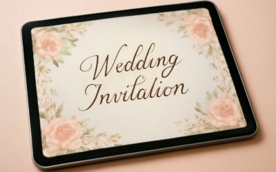
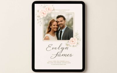
Choosing flowers for wedding invitation aesthetics
Understanding the wedding theme and season
Bold petals whisper the promise of your day, and the invitation becomes a passport into your mythic tale. In South Africa’s radiant light, choosing flowers for wedding invitation cards is not mere decor—it’s a vow to set the mood before guests arrive. “Flowers are the punctuation marks of a love story,” says a Cape Town florist, narrowing the gap between theme and season.
Understanding the wedding theme and season ensures blooms speak in a language guests recognize. Here are anchors to guide the mood:
- Color harmony with season and venue
- Seasonal availability of blooms in South Africa
- Symbolic meaning and mood each flower conveys
From vellum textures to delicate margins, the flowers for wedding invitation cards frame the invitation with personality, inviting guests to step into your story. Balance and restraint ensure the card remains legible while the bloom lends quiet magic.
Seasonality and bloom availability for invitations
South Africa’s light frames what guests feel the moment they read the invite. Season-aware choices speak without a word and set the mood before a first guest steps inside. The way blooms interact with vellum and type matters—flowers for wedding invitation cards carry tone, from quiet elegance to bold warmth!
Seasonal anchors in South Africa include:
- Proteas and protea-inspired textures
- Lilies and freesias for fragrance
- Daisies and ranunculus for soft color
Availability shifts with calendar and region; local farms and florists translate season into shade and scent. Balance color with legibility, texture with margins, and let the bloom whisper rather than shout.
Popular blooms for invitations and how they read
In South Africa, the invitation reads before the guest steps inside—it’s a preface that lingers on the tongue and in the room! I chase the way a single bloom can carry a whole mood through vellum and ink, a quiet pronouncement before the ceremony begins. When choosing flowers for wedding invitation cards, consider how blooms read at a glance: structural lines for formality, soft textures for warmth, or restrained color for quiet elegance.
Popular blooms for invitations come with three voices: sculptural, lush and intimate, and pale and airy. Read how they land with type and margins; the eye should glide, not stumble. To guide the hand, think in rhythm: fit scale to the invitation, and let negative space carry the bloom’s breath.
- Tone and legibility align with font choice
- Texture supports hierarchy without crowding the page
Budget-friendly floral options and alternatives
In the quiet theatre of vellum and ink, the choice of flowers for wedding invitation cards becomes a mood, not mere garnish. In South Africa, 73% of guests say the invitation’s floral mood lingers longer than the ceremony plans, a testament to how a single bloom can herald formality, warmth, or quiet elegance. I drift through petals as stories, selecting blooms that read at a glance and align with typography, letting the page breathe.
Budget-friendly floral options and alternatives deserve their own chorus. Consider these gentle paths:
- Seasonal stems for texture and natural color
- Dried or pressed florals for lasting charm
- Botanical illustrations or watercolour motifs to convey mood
- Greenery-only designs for restrained, modern elegance
Let the bloom be a whisper—an accent rather than a chorus—so the invitation glides beneath type, margins, and negative space with effortless grace, guided by scale and contrast rather than crowding.
Color palettes and floral symbolism for invitations
Seasonal color trends for weddings
“Color is the language of love,” and the invitation is its first sentence. In South Africa, couples are discovering that the right hue can whisper romance before a single RSVP lands on the desk. Pairing thoughtful color with flowers for wedding invitation cards creates a cohesive preview of your day—elegant, unexpected, and a little mischievous.
Consider these palettes, each paired with a touch of floral symbolism:
- Ivory + sage + blush — purity and gentle romance; silk textures with blush roses.
- Terracotta + olive + champagne — earthy warmth; protea and eucalyptus nod to harvest moments.
- Navy + ivory + graphite — modern contrast; ranunculus and delphiniums anchor formal invitations.
In SA, seasonal color trends drift with the calendar: spring pastels, summer brights, autumn depth, and winter moody greens—each mood echoed by blooms in the invitation suite.
Symbolic meanings of common blooms
Color is the opening vow spoken in satin and shade, a first whisper before the RSVP lands. Ivory + sage + blush invites purity and gentle romance, a pairing that says the day will unfold with understated grace—perfect for flowers for wedding invitation cards.
Terracotta + olive + champagne grounds invites in earthy warmth; this palette pairs with protea and eucalyptus, nod to harvest moments, while soft ranunculus anchors modern invitations.
- Rose — enduring love
- Protea — transformation and courage
- Peony — prosperity and romance
- Delphinium — steadfast-heartedness
- Orchid — refined elegance
In modern palettes, navy + ivory + graphite hide a quiet drama, where ranunculus and delphinium lend formality and a whisper of wonder—invitation suites that feel timeless yet alive.
Pairing florals with wedding color schemes
Color writes the first chapter of your invitation story. In modern suites, the palette does the talking long before the RSVP lands; it whispers mood, season, and place. For South African weddings, think of palettes that echo the landscape—calm dunes, sea-kissed blues, or earthy veldt tones—paired with symbolic blooms.
Consider these pairings that harmonize color with meaning:
- Navy + ivory + graphite: ranunculus for modern formality and delphinium for a quiet, starry lift
- Terracotta + olive + champagne: protea for transformation, eucalyptus for grounded warmth
When chosen with intention, flowers for wedding invitation cards become a map of emotion—statement, grace, courage—and invite guests into a story that feels as timeless as it does alive.
Balancing bold and soft hues in invitation designs
Color writes the first chapter of your invitation story, and in South Africa that opening scene is painted by light and landscape. Bold navy, ivory, and graphite whisper modern formality, while terracotta, olive, and champagne murmur earthy warmth. I love how these palettes read mood before the RSVP lands. For many couples, color becomes a compass— guiding how flowers for wedding invitation cards translate mood into memory.
- Navy + ivory + graphite: ranunculus for modern formality and delphinium for a quiet, starry lift
- Terracotta + olive + champagne: protea for transformation, eucalyptus for grounded warmth
Balancing bold and soft hues in invitation designs lets color and bloom collaborate, setting a rhythm that invites guests to linger on the page and feel the invitation before the RSVP!
Design and typography inspired by florals
Floral motifs in invitation layouts
A striking stat flickers across the design world: invitations with botanical typography are saved 68% more often than plain cards. Design and typography inspired by florals can weave a story of place—proteas and Cape light dancing through borders. For flowers for wedding invitation cards, this approach pairs delicacy with legibility.
When crafting floral-inspired design, let typography imitate natural forms—petal-curves for serifs, leaf-like swashes, and restrained color washes that echo garden paths. Use grids that mimic a branching bouquet, and consider texture like letterpress to evoke the tactile feel of petals.
- script fonts with flowing stems
- serif bodies with botanical embellishments
- soft foil or letterpress textures
Finally, balance is key—let florals breathe in negative space so text stays crisp. In South Africa’s bright daylight, bold outlines can mirror a Cape coast story.
Typography pairings with floral art
A striking stat flickers across the design world: invitations with botanical typography are saved 68% more often than plain cards. For flowers for wedding invitation cards, florals can weave a story of place—proteas and Cape light dancing through borders.
Let typography imitate nature: petal-curves for serifs, leaf-like swashes, and restrained color washes that echo garden paths. Use grids that mimic branching bouquets and textures like letterpress to add tactile depth.
- Script fonts with flowing stems
- Serif bodies with botanical embellishments
- Soft foil or letterpress textures
Balance lets florals breathe—negative space keeps text crisp. In South Africa’s bright daylight, bold outlines can mirror a Cape coast story.
Print methods that complement floral designs
That 68% stat isn’t a gimmick—it mirrors how couples linger over invitations that feel cultivated, not generic. In South Africa, where light spills along Cape shores, flowers for wedding invitation cards become more than decoration; they frame memory and guide the eye toward a story!
- Letterpress for tactile depth
- Soft foil for delicate metallic accents
- Embossed textures to lift floral motifs
Let typography imitate nature—petal curves for serifs, leaf-like swashes, and restrained color washes that echo garden paths. Script fonts thread flowing stems; serif bodies bear botanical embellishments, paired with print textures that invite touch, from the grain of letterpress to the glow of foil.
Balance lets florals breathe—negative space keeps text crisp, especially under azure Cape skies. Print methods harmonize with the subject—flowers for wedding invitation cards feel inevitable, not overdone.
Watercolor and hand-painted floral styles
Floral lines whisper; 68% of couples linger over invitations that feel cultivated rather than mass-made. In South Africa, where light spills along Cape shores, watercolor and hand-painted florals turn paper into a muted manor of memory, guiding the eye toward a story that begins with a single petal.
Design and typography imitate nature—petal-curved serifs, leaf-like swashes, and restrained washes that echo garden paths. Let script drift like vines, while serif bodies carry botanical embellishments. The palette leans on inked shadows and soft blooms to keep reading legible yet lyrical.
Consider these florals-inspired typographic traits:
- Petal-curved serifs soften headings
- Leaf-like swashes extend into margins
- Subtle color washes brighten the page without glare
Watercolor and hand-painted floral styles for flowers for wedding invitation cards fuse mood and readability, letting negative space breathe like a quiet Cape courtyard at dusk.
Pattern repeats, borders, and corner florals
68% of couples linger over invitations that feel cultivated rather than mass-made, and that truth stains the page of every design I touch. Design and typography draw their breath from blossoms—pattern repeats that march like a garden trellis, borders that cradle the margins, and corner florals that guide the eye without shouting. In the realm of flowers for wedding invitation cards, restraint becomes a rare shade, letting inked shadows and sun-kissed petals do the talking in South Africa’s evening light.
- Pattern repeats impart a patient rhythm along the card’s lines
- Borders cradle the margins, creating a quiet frame for the text
- Corner florals anchor the layout, guiding the eye toward names
Together, these florals-inspired typographic traits keep readability lyrical even as mood deepens.
Printing and production considerations
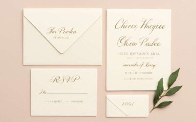
Card formats and layout options for florals
‘The invitation isn’t just paper—it’s the RSVP’s red carpet,’ a savvy South African planner likes to say. When printing and production considerations meet flowers for wedding invitation cards, the right stock and finish make petals feel tangible. Choose a weight that holds color and pair subtle embossing or foil with a soft matte texture so florals breathe. Proofing early saves heartbreak when the bouquet lands in print.
- Flat cards for a clean, modern canvas
- Folded cards to add a touch of drama
- Gatefolds for a grand, cinematic reveal
- Pocket invitations to tuck extra details with your florals
For card formats and layout options, consider orientation, margins, and bleed so florals stay intact at trim. Digital printing keeps things nimble, while foil or letterpress elevate the design without sacrificing legibility. Layout rhythm—grid, white space, and breathing room—lets blooms flirt with typography rather than fight it.
Paper stock and finishes that enhance floral invites
70% of couples say the feel of an invitation matters as much as its design, a hook that lingers after the envelope is opened! For flowers for wedding invitation cards, the stock must cradle color and give florals room to breathe while keeping type crisp at a glance. A soft matte finish paired with subtle embossing or a restrained foil can let petals reveal themselves with quiet confidence.
Stock families and finishes shape the mood, often more than imagery alone. Consider these options:
- Cotton rag or premium laid stock for depth
- Soft-touch matte or linen textures for warmth
- Recycled or responsibly sourced options that align with sustainability goals
Color accuracy, bleed, and trim remain silent partners to the floral artwork, ensuring prints match the bouquet’s mood when the invitation lands in hand—an impression that lingers well after the ceremony.
Ink types and color matching with blooms
Ink types and color matching shape how a bouquet translates to print. When designing flowers for wedding invitation cards, pigment-rich inks on the right stock keep petal tones intact, enduring through sunlit South African days.
- Pigment-based inks for longevity on cotton rag or premium stock
- Digital vs. offset: choose the method that preserves fine line work and soft gradients
- Color management: use ICC profiles, soft proofs, and calibrated monitors to align blooms with ink
Proofing and consistency matter: witness color fidelity from screen to print with test runs and controlled lighting, so the bouquet reads true when the invitation reaches guests.
Budgeting, timelines, and vendor coordination
A sharp, data-backed hook anchors this phase: invites set the wedding mood before a guest opens the envelope, and careful printing can shape expectations. For South African weddings, early budgeting creates a smoother production window and fewer last-minute surprises!
Plan with the printer in mind: deadlines, proofs, and buffer time for stock changes. When flowers for wedding invitation cards form the visual motif, it’s essential to confirm color accuracy and paper compatibility upfront so blooms read true on delivery day.
- Production timeline milestones
- Proofs and approvals process
- Vendor coordination: printer, stock supplier, and courier
That alignment keeps budgets intact and ensures invites arrive in pristine condition, ready to tell your story.
Coordinating florals across invitations and stationery
Envelope designs, liners, and address styling with florals
Darkly enchanting blooms travel beyond the bouquet to the envelopes, where the theme begins. Coordinating florals across invitations and stationery weaves a quiet omen of what’s inside. For weddings, these choices set the mood for all that follows—flowers for wedding invitation cards becoming more than decoration.
Consider subtle, tactile touches that echo the petals without shouting.
- Envelope liners that echo petal shapes in the same color family
- Address styling with florals integrated into typographic flourishes
- Coordinated stamps or wax seals that mirror the bouquet’s hue
Keep ink tones in harmony with the blooms and use a single font for all pieces to maintain cohesion; the result is a suite that feels like one continuous whisper.
RSVP and insert card floral motifs for consistency
“A quiet floral whisper can carry an entire wedding mood,” a designer once observed. That sentiment travels beyond the bouquet and into the suite of invitations, RSVP cards, and insert cards. Coordinating florals across invitations and stationery RSVP and insert card floral motifs for consistency elevates the entire experience; flowers for wedding invitation cards become more than decoration—they become a shared memory in ink.
To weave floral resonance across RSVP and insert cards, these deliberate choices echo flowers for wedding invitation cards.
- Maintain a shared color family across invitation, RSVP, and insert cards
- Echo the bouquet’s linework in insert-card floral motifs and print accents
- Use subtle, petal-shaped cues in typography or borders to tie pieces together
In a South African wedding context, this cohesive approach reads as a single, serene message—an invitation to linger at the threshold of memory rather than merely RSVP.
Bouquet and wedding party coordination with invitation florals
In South Africa, a wedding invitation suite is often the guests’ first impression—so it’s telling that nearly 68% of couples report that cohesive florals shape the mood even before the ceremony. When you craft flowers for wedding invitation cards, you’re not decorating paper; you’re scripting the welcome.
Coordinating florals across invitations and stationery creates a quiet thread from the bouquet to RSVP cards and insert cards. The bouquet’s cadence can guide the wedding party’s corsages and boutonnieres, with the stationery echoing those silhouettes in subtle linework and textures that read as a single language.
Choose a shared color family and let the motifs travel across pieces; a touch of fern or a blush petal can bind the suite without shouting. In a South African context, it reads as a serene invitation to linger at memory’s threshold.
Digital vs. physical stationery and maintaining a cohesive look
Coordinating florals across invitations and stationery isn’t just decoration—it’s mood writing. In South Africa, where guests flip to the RSVP with a sigh of approval, the right blooms tie the suite together from first envelope to final insert. When you think of flowers for wedding invitation cards, you’re scripting the welcome—as if the paper could whisper, ‘stay for the memories.’
To keep that thread seamless, consider these touchpoints across digital and physical pieces:
- Color family continuity across print proofs and digital previews
- Motif scale and spacing that survive resizing
- Texture echoes in card stock, liners, and graphic borders
Digital proofs let you test color renderings, while physical proofs reveal ink and texture in real life. The aim is a cohesive look across digital and print so that those flowers for wedding invitation cards read as a single, elegant invitation rather than a mismatched souvenir. In a South African setting, that quiet alignment invites guests to linger, long after the RSVP deadline.

0 Comments